


Transformers and More @ The Seibertron Store
These are affiliate links. We may earn commissions when you purchase items or services through these links.

WORLDS FINEST #5 D ...

NEW TEEN TITANS #1 ...

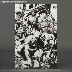
BATMAN 12 CENT ADV ...
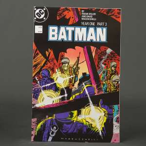
BATMAN #406 Facsim ...
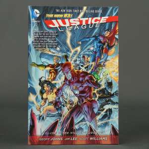
JUSTICE LEAGUE Vol ...
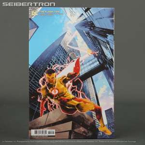
FLASH #799 Cvr D 1 ...

NEW!
BATMAN #143 2nd pt ...

BATMAN #421 DC Com ...

BATMAN #140 Cvr B ...

Batman BRAVE AND B ...
BATMAN #135 Cvr K ...
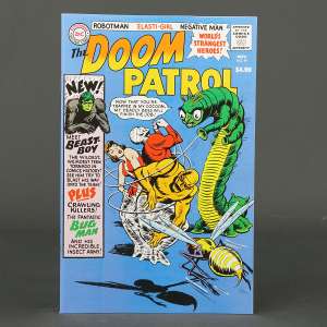
DOOM PATROL #99 Fa ...
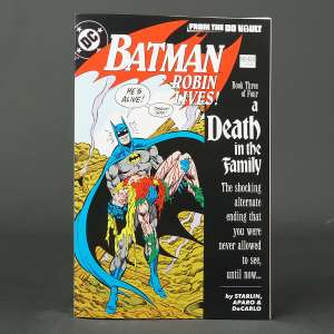
BATMAN #428 Robin ...
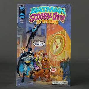
BATMAN & SCOOBY-DO ...
* Price and quantities subject to change. Shipping costs, taxes and other fees not included in cost shown. Refer to listing for current price and availability.