Transformers and More @ The Seibertron Store
These are affiliate links. We may earn commissions when you purchase items or services through these links.
NEW!
GI JOE Real Americ ...
NEW!
GI JOE Real Americ ...
NEW!
GI JOE Real Americ ...
VOID RIVALS #2 4th ...

GI JOE #8 Cvr C ID ...
VOID RIVALS #4 Cvr ...

VOID RIVALS #5 2nd ...
GI JOE AND THE TRA ...

GI JOE Real Americ ...
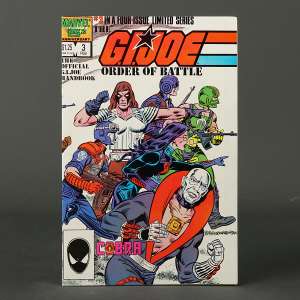
GI JOE ORDER OF BA ...
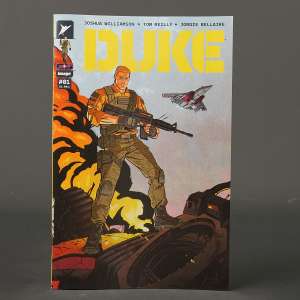
DUKE #1 Cvr A Imag ...
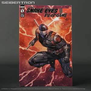
GI JOE SNAKE EYES ...

VOID RIVALS #3 Cvr ...
NEW!
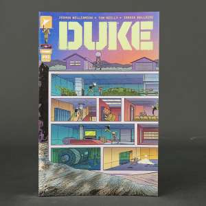
DUKE #3 Cvr C 1:10 ...
* Price and quantities subject to change. Shipping costs, taxes and other fees not included in cost shown. Refer to listing for current price and availability.