prjkt wrote:Blurr
You win hands down for the alt mode, but bot mode (how I display mine) is just bland in comparison.
Can't disagree. Strangely enough the United Blurr lacks a lot of paint apps in bot mode.
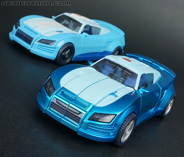
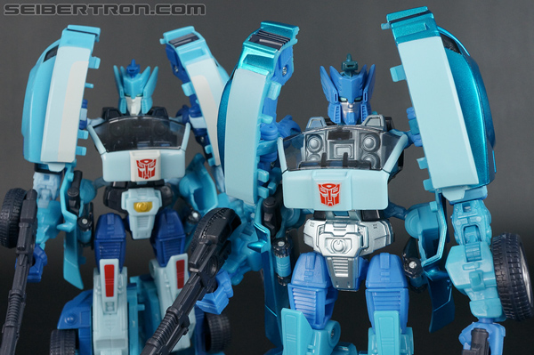
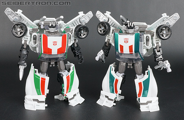
prjkt wrote:Wheeljack
Metallic paint is nice, but that colour just looks like a Christmas decoration...
HA! That's funny... but now I hate you because I'll never be able to un-see that when I look at my United Wheeljack

prjkt wrote:Kup
Ok E-Hobby beats the original Generations Kup, but I find the colour a little off imo, and then the paint job of the recent 3 pack Kup beats both, as it matches the original colour, with more shiny, and quite a G1 paintjob. Although, with four releases of this one character in the one mould it's kind of hard to say who wins definitely.
Well damn. You got me again. United Kup is too bright to be considered the quintessential cartoon accurate Kup, but it IS still fitting in a way since the toy was bright like that. And the placement of his apps are still spot on. I still stick my my E-Hobby though, I guess I just like them bright

prjkt wrote:Cyclonus
Backing up on the opinion that RTS Cyclonus beats Universe/Henkei releases. The colour is a little deeper, more cartoon accurate (in my mind) and less contrast between components. Deep metallic purple and pale purple plastic doesn't really mix in my mind.
I see it three ways:
Universe Cyclonus - Original G1 toy accurate.
RTS Cyclonus - Terrifically toon accurate
Henkei Cyclonus - Lord only knows

prjkt wrote:onto another character I think Hasbro's won with is the 3 Pack Perceptor - got rid of the yellow translucent plastic of the RTS version, kept the chromed parts and added the shiny metallic paint of the united version. A best of both worlds type thing I think.
Funny you should mention that. I frankenstined my own Perceptor. Chrome bits from RTS, and the everything else from United