Page 1 of 1

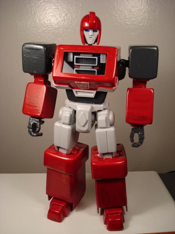
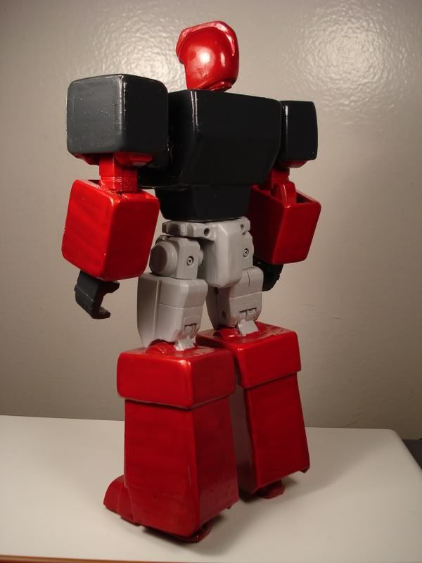
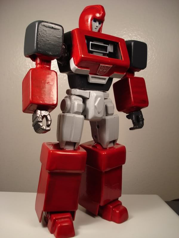
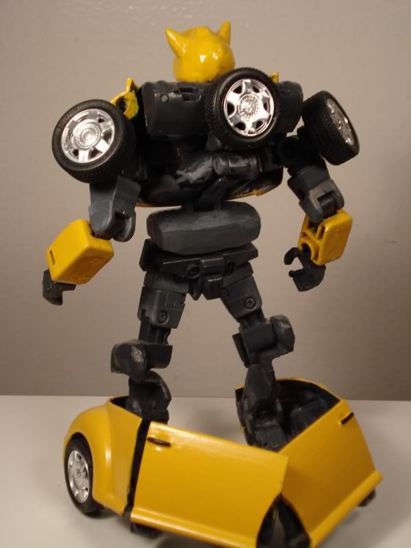
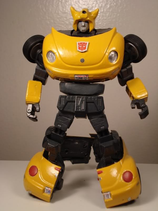
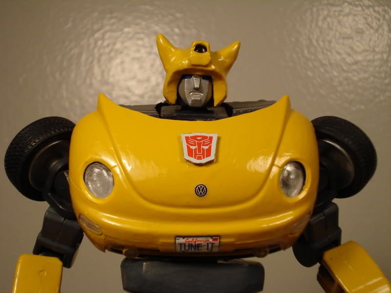
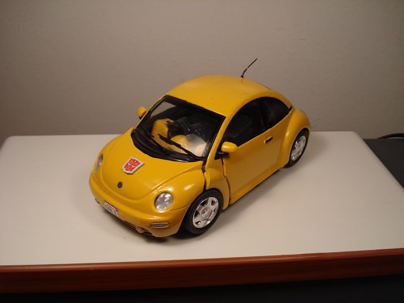
Ironhide and Bumblebee

PostPosted: Thu Dec 07, 2006 11:24 am
by TM Mench0y
Here are some of the first batch of Transformers custom I worked with. Finally decided to post it.

ImageImage
ImageImage
ImageImage
ImageImage

PostPosted: Thu Dec 07, 2006 11:59 am
by jimsloth
Wow, I can't believe you didn't post your bumblebee earlier! It Transforms! Looking at the first pic of him and knowing some of your other work, as I was scrolling down I definitely didn't expect to see that!

P.S. Your Ironhide looks amazing too, but I'm still too blown away by BB to really appreciate him as much as I should.

PostPosted: Thu Dec 07, 2006 12:14 pm
by Pun-3X
Seriously about the Bumblebee! That is a great job!

I love Ironhide, but his face looks....ghostly. The rest of him is awesome. I especially like the 'internal' chest bits. I like doing that kind of thing too. Is there a piece of transparent plastic in front? It's hard to tell, but there looks like a 'glare' in one of the pics.

PostPosted: Thu Dec 07, 2006 1:46 pm
by Skullgrin140
Superb! Really Superb!

PostPosted: Thu Dec 07, 2006 2:57 pm
by Nemesis Sturmvogel
Well made.

PostPosted: Thu Dec 07, 2006 6:16 pm
by Tramp
Honestly, I don’t like them. The main problem is they don’t look like they could be fabricated metal; they don’t look “real” enough. They look like they’re sculpted clay, and the purely chromatic paint job just makes them look cartoony, not cartoon accurate. The windshield in Ironhide’s chest should fill up more of the space on his chest and not have such a thick frame. There aren’t enough details like panel lines, headlights, vents, pistons, gears, actuators, etc. They’re too smooth, too rounded, too simplified. They need more edges and more of a mechanical—“fabricated”—feel, less of a “sculpted” look. Bumblebee’s horns are also way too big.

Menchoy, you are an amazing sculptor, but you need to work on your fabrication skills. There is a big difference between the two.

PostPosted: Thu Dec 07, 2006 10:58 pm
by gawd6sic6
im not even trying to start an argument here. but damn man. you cant really say anything nice can you..

he has done a damn fine sculpting job.. and if you havent noticed.. the cartoony look , is his thing. he doesnt need the robotic feel to them. doesnt need the extra detailing. they are fine for his artistic view of the transformers. this is how HE wants to see them.

mench , as i have said with the zelda stuff.. awesome work sir!

PostPosted: Thu Dec 07, 2006 11:27 pm
by Tramp
I have no intention of arguing. I am simply giving an honest critique on where he can improve. I’m not sugar-coating anything, nor being overly harsh. I am just giving my honest, educated opinion. What Menchoy chooses to take from that is his choice. You can’t improve if all you hear is praise, or if all you hear is criticism. You need both. I give praise where I feel it is warranted, and criticism where I feel it is warranted.

PostPosted: Fri Dec 08, 2006 12:31 am
by Captain Crooks
Hehe, I love Bumblebee's number plate - awesome!

That fourth wheel has me puzzled - is it under the hood somewhere?! I love the wheel on the back idea too - that's quite clever! I'm usually too obsessed with symmetricality to come up with good ideas like that - you've given me food for thought there, Menchoy!

EDIT Okay okay, I spotted the fourth wheel, heh - does having one wheel on the foot cause it to inbalance at all...? Or, are there actually FIVE wheels, the one on the back is a spare??!! :wink:

PostPosted: Fri Dec 08, 2006 9:52 am
by ptitvite
:D :D :D I love your work!! And BB transforms!!!!!!!!!
Do you use Bionicle joints? Are the figures heavy?
I like the paint job but I prefer mate finish.
Anyway's I just can't think of anything else to say while being amazed by these figures!!!
****************************************************
:idea: :idea: :idea: :idea: :idea: :idea: :idea: :idea: :idea: :idea: :idea: :idea: :idea: :idea: :idea:
And TRAMP, we are ARTISTS, we are unique and have different styles.
For all the work that's been done here by Menchoy, I would suggest we respect his vision of Transformers.
I'm not talking about sugar coating here....
Please think about it. I want Transtopia to stay alive!

BTW, we already have an expert in critisism.....hey Ravage?! lol :wink:

PostPosted: Fri Dec 08, 2006 12:07 pm
by TM Mench0y
Thanks for the comments everyone.

Asphalt - The 4th tire is just there for looks, the dash board with the wheel on his back comes off when he's in vehicle mode, and replaced with the roofing.

Tramp - Yeap, I am quite aware of the detail I put on these customs, and I intentionally made it that way. The inspiration for these is in fact the cartoon series and I wanted to keep it just plain and simple with some personal changes. Some changes I made with Ironhide is that I made him more bulkier, plus minor details such as a raise autobot insignia and a clear chest panel to show some mechanics within. Bumblebee, when I made him I was just on the experimental stage and I was still honing my customizing skill, so I learned a lot from making him. He's not perfect, but I love that little guy and to me he is a masterpiece. Thanks for the comment on my sculpting by the way.

Gawdsic - Thanks again man and for defending my work as well. He is entitled to his opinion though, and I do encourage both positive and negative feedback so I can get a clearer view on my overall work from a different point of view.

Captain Crooks - He he, yeah I love the plate number too. Good thing it came with the model, or otherwise I would have probably just left it blank.

Ptivite - thanks bro. Hmmm... matte finish, maybe I should try that one day. On my next custom I'm trying something new, going more on a flat colored look.

PostPosted: Fri Dec 08, 2006 12:09 pm
by grimlockprime108
i don't know about that.....ravage and tramp seem to be pretty even on their critiques :shock: :lol:

PostPosted: Fri Dec 08, 2006 12:34 pm
by ptitvite
Mench0y wrote:Thanks for the comments everyone.

Ptivite - thanks bro. Hmmm... matte finish, maybe I should try that one day. On my next custom I'm trying something new, going more on a flat colored look.


I tried both...Mate finish hides the smallest imperfections you can't get rid
off while gloss shows them very clearly. It was a suggestion I got from
others for my kb's and after trying it, I got rid of gloss clearcote.

PostPosted: Sat Dec 09, 2006 2:24 am
by Tramp
Ptitvite wrote::D :D :D I love your work!! And BB transforms!!!!!!!!!
Do you use Bionicle joints? Are the figures heavy?
I like the paint job but I prefer mate finish.
Anyway's I just can't think of anything else to say while being amazed by these figures!!!
****************************************************
:idea: :idea: :idea: :idea: :idea: :idea: :idea: :idea: :idea: :idea: :idea: :idea: :idea: :idea: :idea:
And TRAMP, we are ARTISTS, we are unique and have different styles.
For all the work that's been done here by Menchoy, I would suggest we respect his vision of Transformers.
I'm not talking about sugar coating here....
Please think about it. I want Transtopia to stay alive!

BTW, we already have an expert in critisism.....hey Ravage?! lol :wink:


And as artists, without both positive and negative feedback, we would never improve. That is one of the key lessons I learned going through art school. With every project, we were critiqued by not only the instructor, but also our peers. Every detail, both good and bad was pointed out, what we all liked about a piece as well as what we didn’t like about it; all so that we could improve our skills as artists. It isn’t just about respecting an artist’s “vision”, but also pushing that artist to constantly improve. Even MenchOy pointed that out. I really like much of his work, but I also see where he could be a lot better.

PostPosted: Sun Dec 10, 2006 2:02 pm
by jimsloth
Tramp wrote:And as artists, without both positive and negative feedback, we would never improve. That is one of the key lessons I learned going through art school. With every project, we were critiqued by not only the instructor, but also our peers. Every detail, both good and bad was pointed out, what we all liked about a piece as well as what we didn’t like about it; all so that we could improve our skills as artists. It isn’t just about respecting an artist’s “vision”, but also pushing that artist to constantly improve. Even MenchOy pointed that out. I really like much of his work, but I also see where he could be a lot better.


I see and agree with most of this point, also going to an art school where we critiqued both good and bad. One thing my school had us do though. You couldn't give only one side. You want to critique a work, that means YOU give BOTH the pros and the cons. Yea, a lot of people go around here only patting each other on the back, which is all well and good, but I say if your going to critique, do it right.

Also remember that Menchoy said these were his older works. In my opinion he has improved in his sculpting of TFs since these were made. In critiquing an artist work you also have to keep context in mind.

PostPosted: Sun Dec 10, 2006 3:56 pm
by fromwednesday747
jimsloth wrote:Also remember that Menchoy said these were his older works. In my opinion he has improved in his sculpting of TFs since these were made. In critiquing an artist work you also have to keep context in mind.


I completely agree. I mean, you can just look at his Hot Rod and see the major difference. It looks much more metalish, and is certainly more polished. However, i do really like both of these bots.

PostPosted: Sun Dec 10, 2006 4:48 pm
by Pun-3X
Tramp wrote:
And as artists, without both positive and negative feedback, we would never improve.


I don't think there's much room for argument there. My impression from your critique was that you criticized for elements you weren't even sure Menchoy was shooting for.

I think you should have maybe asked, "what look were you going for? What style were you hoping to create?" It turned out he WAS looking for the things you mentioned: A sculpted, more cartoony feel. Not necessarily cartoon accurate. Some of the things you stated he needed to improve, he wasn't really gunning for. (Fabricated/mechanical)

I did notice you gave a lot of detail as to what to add/improve, so again it isn't so much that. (and did compliment his sculpting skill, which I agree with) I think you simply assumed too soon what he was attempting versus his end result. That's all.

PostPosted: Mon Dec 11, 2006 1:02 am
by RavageX-9
Ptitvite wrote:BTW, we already have an expert in critisism.....hey Ravage?! lol :wink:

grimlockprime108 wrote:i don't know about that.....ravage and tramp seem to be pretty even on their critiques :shock: :lol:

As usual, I'm only interested in ME. ;>
I don't know how sucessful I am at keeping my critiques even. I try, but I'm definately not a good example to follow. :>

Is Bumblebee's helmet the only thing you sculpted from scratch? I have to admit, I think it could have done with more work. As it is now, it just looks like a sphere with an inverse-sphere carved out of the bottom-front, and 3 bits added on. (the horns and crest) It just looks too blobby compared to his face and such.
I think Ironhide turned out much better. I'm guessing he doesn't transform, otherwise you would have taken pictures. His head looks a little tall. it makes his head look narrow. but you have to work with what you can get, I guess.

see, I didn't say anything positive about Bumblebee, and I didn't say anything specific in the positives about Ironhide...

uhhh... Bumblebee looks... original. (IE: not G1 or even Alternators concept artwork) while I don't like the looks of the backs of his legs, the rest seems pretty well laid out. His arms and shoulders look pretty decent. I can't remember who was doing an Alt style Bumblebee recently, but the arms/shoulders on that one had looked very inhuman. I think the wheels balance out his shoulders nicely.

and Ironhide... well aside from some joints looking like they have very limited range of motion :> nothing really stands out on him as bad. I don't remember exactly what he looks like, so I don't know about toon/comic/toy accuracy.