Page 1 of 1

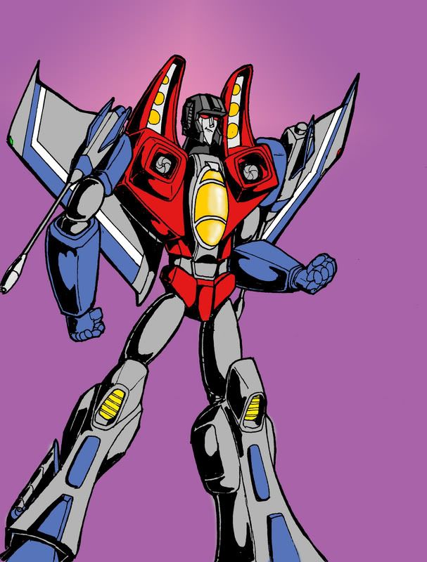
Starscream Animated Version

PostPosted: Mon Aug 20, 2007 6:19 pm
by Charger426
This was an experiment really, to try drawing animated style. Different from my usual. Not perfect, but I like the proportions. Broad in the shoulders, narrow at the waist. Like a swimmer or lightweight fighter, Since Screamer here is a flier, he should not be weighted down with a lot of mass.
Just my thought on it.
Image

PostPosted: Mon Aug 20, 2007 6:29 pm
by Dispensor
Looks awesome, but the right arm could use some work. The elbow perspective is totally wrong, and the hand looks like the palm is facing the viewer and the fingers are just bent all the way back.

Also, the right thigh should be ad big as the other, and the knee should overlap it,

PostPosted: Mon Aug 20, 2007 6:39 pm
by osiricon
Nice I see you trying more coloring. I like the face,looks like the cartoon version

PostPosted: Mon Aug 20, 2007 6:46 pm
by Charger426
Dispensor wrote:Looks awesome, but the right arm could use some work. The elbow perspective is totally wrong, and the hand looks like the palm is facing the viewer and the fingers are just bent all the way back.

Also, the right thigh should be ad big as the other, and the knee should overlap it,


Thanks for the tips. Very true, all of it. Its not perfect.

osiricon wrote:Nice I see you trying more coloring. I like the face,looks like the cartoon version


Yeah, trying is the key word :). good, I was trying to get that animated look. Also like Namor, the submariner. Both are arrogant.

PostPosted: Mon Aug 20, 2007 7:00 pm
by Charger426
Dispensor wrote:Looks awesome, but the right arm could use some work. The elbow perspective is totally wrong, and the hand looks like the palm is facing the viewer and the fingers are just bent all the way back.

Also, the right thigh should be ad big as the other, and the knee should overlap it,


I probably should get someone to "proof read" my pencils :oops:

PostPosted: Mon Aug 20, 2007 7:39 pm
by osiricon
We learn from criticis,but I say this "those who can..do those who can't..criticize". I take the advice of those that can, and can do better than I.

PostPosted: Mon Aug 20, 2007 8:11 pm
by i_amtrunks
Love the colouring, it reminds me of the old G1 Marvel comics covers, but with more variation in the colours used!

You've really captured Starscream in the face too, even if you had only shown the pencils, and not given a name, it would not have been hard to pick who it was.

PostPosted: Mon Aug 20, 2007 10:21 pm
by Dispensor
Charger426 wrote:
Dispensor wrote:Looks awesome, but the right arm could use some work. The elbow perspective is totally wrong, and the hand looks like the palm is facing the viewer and the fingers are just bent all the way back.

Also, the right thigh should be ad big as the other, and the knee should overlap it,


Thanks for the tips. Very true, all of it. Its not perfect.


Yeah, but it's still damn good.

PostPosted: Tue Aug 21, 2007 1:22 am
by Burn
I want to say it's great, but I can't bring myself to like this animated style. :?

And that's not a insult to your work Charger, i've always liked your work, it's just this whole animated thing I just can't like.

PostPosted: Tue Aug 21, 2007 1:26 am
by SPC Airborne
looks awesome!

PostPosted: Tue Aug 21, 2007 1:37 pm
by babylon queen
This is so cool.

PostPosted: Tue Aug 21, 2007 1:57 pm
by Sonray
good job. Looks better than the Jay-Lenoscream.