Page 1 of 2
New Photos of Universe Seacons (Combined!)

Posted:
Fri Aug 24, 2007 5:27 pmby Skowl
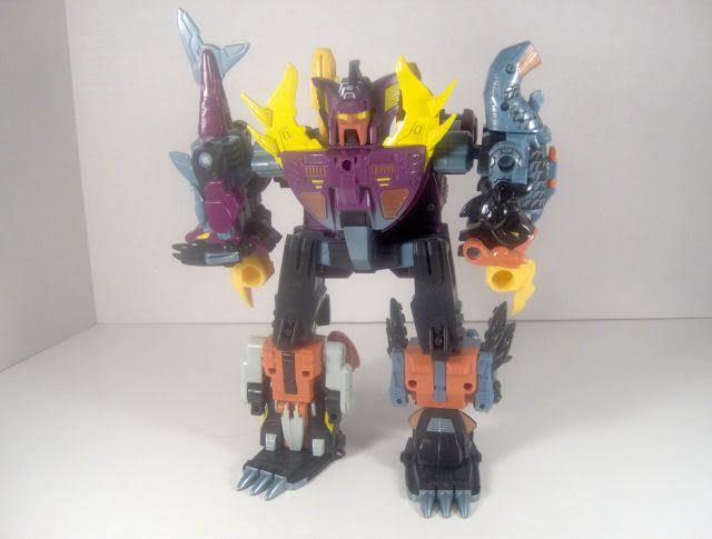
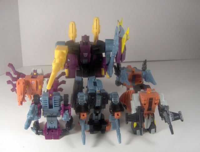
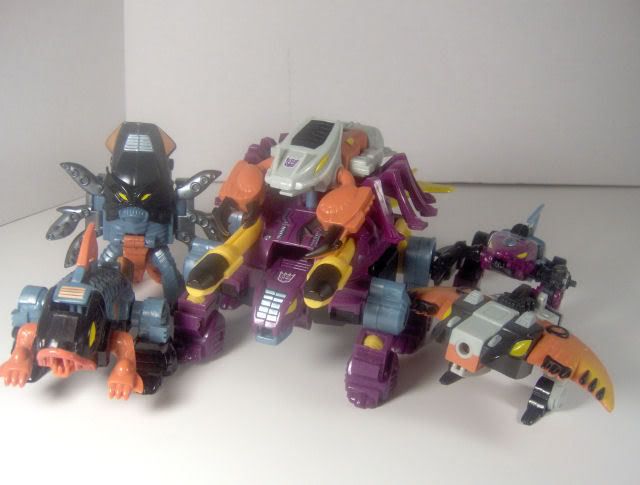
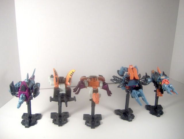
Courtesy of Transfan2 over at TFW2005.com. He was able to get his hands on one of the prototype sets a long time ago when they popped up on eBay. He had taken photos before, but they were small and didn't cover much of the detail in the repaints, and there were no full body shots of Piranacon (Piranhaking as he was supposed to be called had he been release in the Universe line back in 2004)
So here's some better pics Transfan2 took after the Collector's Club began hinting at a possible exclusive release of the set. I still love the colours, though I still prefer the original G1 and BW2 sets, these are still nice, and will look extra cool with the three sets together.
Finally, after putting up with an endless amount of hommages to the Constructicons and a hundred thousand repaints of the Combaticons, a new version of Hot Rod/Rodimus every 15 seconds, never-ending Ultra Magnus toys and Seeker repaints out the ass, one of
MY favourite old school TFs may finally come back!


Posted:
Fri Aug 24, 2007 5:54 pmby MegaDave
honestly colour scheme wise id rather go for God Neptune over this and the G1 original
Love the mold tho and glad to see its making a come back out of obscurity - will abominus be next?

Posted:
Fri Aug 24, 2007 6:12 pmby Overcracker
Not liking the peach color there. But since this is a proto, i'm sure it will be changed for the final release. Hopefully something akin to their G1 color scheme.
And yeah so stoked they are getting a released.
I guess I'll give in and get a Club Membership when they are finally released.
If anybody is doing this, maybe they should start taking pre-orders, so they have an idea of how much demand there is for this set. And then maybe they can make it a General Release maybe through hasbro toy store. Or something that does not require a club membership.

Posted:
Fri Aug 24, 2007 6:26 pmby Tigertrack
I really like the color scheme EXCEPT the yellow. It looks so out of place. It needs to be off yellow like the rest of the colors are not their bright versions, but a toned down greyer version.
Yellow needs the same done to it.


Posted:
Fri Aug 24, 2007 6:45 pmby Geekee1
tigertracks 24 wrote:I really like the color scheme EXCEPT the yellow. It looks so out of place. It needs to be off yellow like the rest of the colors are not their bright versions, but a toned down greyer version.
Yellow needs the same done to it.

See, I disagree. I think the yellow is the color that "pops." It's the one that pulls you in and then you look at all the other stuff. But hey, you can't please everybody.

Posted:
Fri Aug 24, 2007 6:49 pmby Tigertrack
Geekee1 wrote:tigertracks 24 wrote:I really like the color scheme EXCEPT the yellow. It looks so out of place. It needs to be off yellow like the rest of the colors are not their bright versions, but a toned down greyer version.
Yellow needs the same done to it.

See, I disagree. I think the yellow is the color that "pops." It's the one that pulls you in and then you look at all the other stuff. But hey, you can't please everybody.
Glad it works for you. It's just the chest plate/split spikey tails...too much to me, but who knows, it may look great in person. Can't be worse than pink right?

Posted:
Fri Aug 24, 2007 7:04 pmby Redimus
it's a bit garish.

Posted:
Fri Aug 24, 2007 7:26 pmby Autobot032
I'm all over this sucker.
And no, the colors probably won't change. This isn't a resin proto. This a is a test shot. Aside from some paint changes, what colors the plastic is molded in...they'll most likely remain the same.

Posted:
Fri Aug 24, 2007 9:06 pmby Skowl
The one and only thing I hope they change with the set is Nautilator and Seawing's colours. They should be that blue-ish grey colour the others have, not white, they look out of place, it hurts the dynamic of the set (which is a shame, because that blue/grey, black, purple and orange work perfectly with each other, the white just throws it off balance).
Strange, for each individual member, I prefer one from a different set. My favourites for each are Seawing (G1 colours), Skalor (Universe colours), Overbite (G1 colours), Tentakil (Universe colours), Nautilator (G1 colours), Snaptrap (BW2 colours) and Piranacon (BW2 colours).
I think Skalor is my favourite of the bunch in their new colours though.


Posted:
Fri Aug 24, 2007 10:12 pmby UltraPrimal
Overcracker wrote:If anybody is doing this, maybe they should start taking pre-orders, so they have an idea of how much demand there is for this set. And then maybe they can make it a General Release maybe through hasbro toy store. Or something that does not require a club membership.
No, no, NO! No Hasbro Toy Shop! That pretty much screws everyone outside the US out of getting them. If the Club were to that it would be foolish. They want to sell as many of them as possible.
Though I do agree. The BW2 color scheme is far better, and the G1 colors are slightly better, than this ones. But beggers can't be choosers. Depending on the price, I may buy a second set and repaint it to look like the BW2 set.

Posted:
Fri Aug 24, 2007 11:44 pmby Counterpunch
Love it!

Posted:
Fri Aug 24, 2007 11:53 pmby Ninja Sixshot
like most of you, the colors suck. but seacons are seacons.

Posted:
Sat Aug 25, 2007 12:38 amby HoosierDaddy
What size are those? I really don't care for them myself. They just look so cheap.


Posted:
Sat Aug 25, 2007 9:33 amby Skowl
Ninja Sixshot wrote:like most of you, the colors suck. but seacons are seacons.
I actually love the colours! The Seacons always needed to be "darker" (so the contrast is better with the two other sets), and this colour combination works perfectly, very "coral reef" like.
They look great in beast mode.
HoosierDaddy wrote:What size are those? I really don't care for them myself. They just look so cheap.

They're the same size as all the standard combiner TFs of G1. The limbs are about as big as the scout class toys from Cybertron, and Snaptrap is about the size of a deluxe figure.

Posted:
Sat Aug 25, 2007 9:41 amby Tigertrack
See I like how all the colors have murky, washed look, it looks like they are underwater, sort of, except the yellow.
I like the yellow as the highlight colors for the eyes, and other small details, even the hands and weapons since they would be hidden most of the time and not get the wear and murkiness that most other parts would get. But the chest plate yellow pieces are too large of amounts of this color.
All IMHO, of course. I'll still nab it and enjoy it.
Skowl I'd like to see your favorites combined into God Piranhacontune, that would be quite a creature...

Posted:
Sat Aug 25, 2007 9:47 amby Dagon
First off, let me add my voice to the choir of those saying thank goodness and about time! Quite possibly the worlds' longest running Transformer reissue is finally coming to fruition. I know that you for one Skowl have got to be super pumped about this one.
I like the color scheme, but not to sound like a jack ass like the whole 'scalper' arguement going on over there, but I think some of the ugliness of the paint is that who ever has this set assembled big P in a different order. Like Classics Devastator, how two limbs were green and the other two were black and in theory, two like colored limbs were kind of ment to be a matching set of limbs. Like the green crane and bulldozer were ment to be arms while the black ones, legs. Just looking at Pihranaon there makes me think that Overbit and Skalor were ment to be a limb pair and Seawing and Tentakill the other, with Nautilator serving as the weapon.
As far as other combiners go, I love the Combaticons but they have been done literally to death, and we need to stop hand-jobbing Devastator as the greatest thing ever developed. I'd love to see a new Abominus, but I'd rather see a gestalt get the actual Classics/Universe treatment and see what they can do for them nowadays.
Go Seacons! I'm orderin' one.

Posted:
Sat Aug 25, 2007 11:41 amby Skowl
Dagon wrote:First off, let me add my voice to the choir of those saying thank goodness and about time! Quite possibly the worlds' longest running Transformer reissue is finally coming to fruition. I know that you for one Skowl have got to be super pumped about this one.
I like the color scheme, but not to sound like a jack ass like the whole 'scalper' arguement going on over there, but I think some of the ugliness of the paint is that who ever has this set assembled big P in a different order. Like Classics Devastator, how two limbs were green and the other two were black and in theory, two like colored limbs were kind of ment to be a matching set of limbs. Like the green crane and bulldozer were ment to be arms while the black ones, legs. Just looking at Pihranaon there makes me think that Overbit and Skalor were ment to be a limb pair and Seawing and Tentakill the other, with Nautilator serving as the weapon.
As far as other combiners go, I love the Combaticons but they have been done literally to death, and we need to stop hand-jobbing Devastator as the greatest thing ever developed. I'd love to see a new Abominus, but I'd rather see a gestalt get the actual Classics/Universe treatment and see what they can do for them nowadays.
Go Seacons! I'm orderin' one.
I've always looked at the limbs the same way. In G1, Skalor and Tentakil were the only two limbs to sport the blue and pink, meaning they were a "pair" (the legs, specifically), and Nautilator and Seawing were the only ones to have the black and green, meaning together they made the arms. Overbite had a mix of these two colour schemes, so he made the gun.
Same with the Universe version, Nautilator and Seawing are the only ones with white, so they make the arms. While tentakil and Skalot share the same colour scheme, making them the legs. For proof, look at how the black and blue/grey from the legs (Snaptrap's legs combine with Tentakil and Skalor) rises up on Snaptrap's shield/Piranacon's chest and fades into the purple on the rest of Snaptrap's shield. It's obvious they intended Skalor and Tentakil, the "darker" limbs, to be the legs. There is no other explanation. It's like Piranacon's been walking waist-high in a toxic sludge filled ocean or something...


Posted:
Sun Aug 26, 2007 10:37 amby Skowl
*Bump*
This thread got buried way too fast... I'm sure more people would be interested in these photos.

Posted:
Tue Aug 28, 2007 4:54 pmby microclone
lets hope this makes it as an encore toy also!! in a G1 style box with the old colours for sure that would be a most wanted item for many. so the critter missing from the god neptune set has returned, quite promising.

Posted:
Tue Aug 28, 2007 6:42 pmby Counterpunch
This toy pleases me greatly!

Posted:
Tue Aug 28, 2007 6:44 pmby Liege Evilmus
An awesome set, but I don't think that club exclusives should get to bear the Universe title.

Posted:
Tue Aug 28, 2007 7:11 pmby i_amtrunks
Skowl wrote:*Bump*
This thread got buried way too fast... I'm sure more people would be interested in these photos.
Thanks for the bump, I missed this the first time around.
I'm impressed with the colours, the figures look good in them, the mauve in particular.
Too bad these guys are a club exclusive, I would have bought them if they had have had a retail release, but Transformers club membership is a waste of money for me.

Posted:
Tue Aug 28, 2007 7:17 pmby TheMuffin
Those colors are horrid. That single handedly killed any notion I had of adding a G1 figure to my collection.

Posted:
Tue Aug 28, 2007 9:53 pmby Decatron
No bright turqoise and pink color scheme? Suprised...

Posted:
Tue Aug 28, 2007 9:56 pmby Blurrz
Seacons? More like Reefcons!
I'm glad they got rid of that turquoise purple colour scheme.

