Page 1 of 3
New CGI shots of Transformers on Lunchables Website

Posted:
Thu May 10, 2007 6:59 amby Skowl
Posted:
Thu May 10, 2007 7:24 amby Sentinel Pax
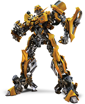
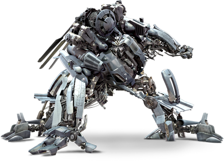
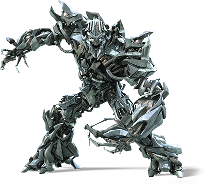
My God! Those are great. Except for Frenzy...but they actually made Starscream look cool! And Megs' new head looks so much better than the old one. Blackout's bio almost makes me think of Dinobot in a way...only he's pure evil. The Ironhide picture just confirmed for me that he's going to be kicking major ass in this movie, though. Bumblebee's just a pretty-bot, haha.
Posted:
Thu May 10, 2007 7:29 amby Leonardo
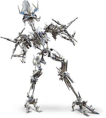
I agree, Starscream does look quite ripper. I can't work out what colour he's supposed to be, though. In some shots, he's a silver/grey, in others he's a sort of rusty brown.
Posted:
Thu May 10, 2007 7:38 amby Bender Prime
Those renders are crisp! and High Def as well, nice!
Love it! Love it Love it!
Posted:
Thu May 10, 2007 7:47 amby For Gondor!
Same old, same old. Everything just blurs into each other, silly poses too.
Posted:
Thu May 10, 2007 7:51 amby Bender Prime
It's not the same ol same ol, they are new renders, and if you don't like it then don't go see the film and quit bitchin about it broken record.
Posted:
Thu May 10, 2007 8:01 amby Fang Wolf
Um, they kinda look like the vehicle modes are shells that seperate then rejoin to the robot, atleast in these renders. I was starting to like them, Screamer, oddly enough, Jazz and Blackout, are turn offs.
Posted:
Thu May 10, 2007 8:02 amby Milanion
I like the final renders on most of these. SS isn't too shabby actually. I love Ironhide and Blackout.
Come on, where's the rest of them?!
Posted:
Thu May 10, 2007 8:03 amby Leonardo
We still haven't seen an awful lot of Brawl, have we?
Posted:
Thu May 10, 2007 8:11 amby Ravage XK
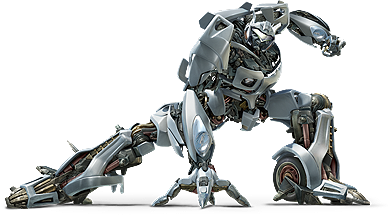
Jazz is the looker. Most conventional design of the lot.
Posted:
Thu May 10, 2007 8:18 amby edcomics
Wow, it's like "Where's Waldo?" except here it's more like "Name that Random Detail!" Blackout is a mess, as are some of the others (Megatron, anyone?). As small as these are, they're some of the crispest-looking renders we've seen. Now more than ever, though, the robots look to be very fragile. From Starscream's paper-thin knee armor and toes to Ironhide's WTF feet and prolapsed intestine, these guys are looking... well, some of them are looking bad.
I'll admit, though, some look better than they have in previous shots. Jazz looks interesting, and definitely more cohesive than some of the other designs. At this point, though, even Prime is looking fairly abominable. Perhaps it's just the pose. I don't know. It's nice that they decided to put Big Convoy in this film (Ironhide). The quality of the renders is, of course, very nice. I like the texturing, but is that enough to save weak designs? What is up with Starscream's face, anyway? It looks different (read: worse) every time I see it.
After all these months, I'd almost gotten used to the designs after seeing the toy photos, etc... These new images just hit me with the same kind of surprise/disgust that the earliest leaked images did. It's like eating rotten eggs and trying to pretend it's chocolate.
Posted:
Thu May 10, 2007 8:21 amby jonusjaxon
OMFG. Those are amazing.
Posted:
Thu May 10, 2007 8:28 amby For Gondor!
Bender Prime wrote:It's not the same ol same ol, they are new renders, and if you don't like it then don't go see the film and quit bitchin about it broken record.
Sorry, I'll be sure to run my future posts by you first.
And many of these are old renders like the Prime and Bumblebee ones, and all these designs still have the horrible aesthetic we've known about for a long time so yeah it is "same old" Bender Prime.
Posted:
Thu May 10, 2007 8:29 amby Talyn
Man, how many times are they gonna chance Megatrons face, this is another new version, Starscream's looks a bit different too..
Posted:
Thu May 10, 2007 8:31 amby For Gondor!
edcomics wrote:Wow, it's like "Where's Waldo?" except here it's more like "Name that Random Detail!" Blackout is a mess, as are some of the others (Megatron, anyone?). As small as these are, they're some of the crispest-looking renders we've seen. Now more than ever, though, the robots look to be very fragile. From Starscream's paper-thin knee armor and toes to Ironhide's WTF feet and prolapsed intestine, these guys are looking... well, some of them are looking bad.
I'll admit, though, some look better than they have in previous shots. Jazz looks interesting, and definitely more cohesive than some of the other designs. At this point, though, even Prime is looking fairly abominable. Perhaps it's just the pose. I don't know. It's nice that they decided to put Big Convoy in this film (Ironhide). The quality of the renders is, of course, very nice. I like the texturing, but is that enough to save weak designs? What is up with Starscream's face, anyway? It looks different (read: worse) every time I see it.
After all these months, I'd almost gotten used to the designs after seeing the toy photos, etc... These new images just hit me with the same kind of surprise/disgust that the earliest leaked images did. It's like eating rotten eggs and trying to pretend it's chocolate.
They do look very fragile and haphazard. Don't know what they were thinking..
I also agree Jazz is by far the best, at least he looks somewhat familiar and coherent, and not a jigsaw puzzle.
Posted:
Thu May 10, 2007 8:32 amby Leonardo
We have to remember that Cybertronian metals may be a lot more durable and much stronger than ours, so them looking fragile might not mean anything.
Posted:
Thu May 10, 2007 8:36 amby For Gondor!
I see your point, but visually it's off-putting for many when they look like that. I mean, Ironhide's legs for example, are a disaster, so messy to look at.

Posted:
Thu May 10, 2007 8:37 amby Skowl
edcomics wrote:As small as these are, they're some of the crispest-looking renders we've seen.
If you mean the pics are small, they're not. Read through the whole news post and click the link to the gallery to see the huge, full-sized renders.
Those smaller pics were just posted to give users a quick look, check out the link for the real full-sized images.
Posted:
Thu May 10, 2007 8:45 amby Ground Zero
Nice. Some of these look really great. Jazz, Bumblebee, Starscream and Blackout stand out as looking pretty darn cool.
I do find that the "busy" look of the characters created by their design is a bit of a detriment to some of these stills and it's not helped at all by strange pozes like the one Ironhide and Prime are using.
Overall though, they are quite convincing. Especially the ones in more traditional poses (again, Screamer, Jazz, Bumblebee and Blackout)
Posted:
Thu May 10, 2007 9:06 amby Skowl
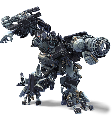
Man, I know those CGI renders are top-notch, but even that just can't make Megatron look good to me. Which is a shame because I love his head design, but his body is just horrible. His hands make no sense and his little stubby feet are laughable. He just looks like a giant, indistinguishable mess of plates and spikes.
Starscream looks cool, I'm really liking that design now, much more than Megatron anyways.
Ironhide rocks, but his legs and his feet are way too busy.
Jazz is my favourite of the bunch. He has lots of parts and panels and looks 'complex' without looking 'busy' and 'messy' like some of the others.
Blackout is cool, as usual, but that pic makes him look small... he shouldn't be crouched down like that - he's supposed to be huge, give him a pose that reflects that.
Frenzy is still the ugliest thing I've ever seen in my entire life.
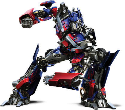
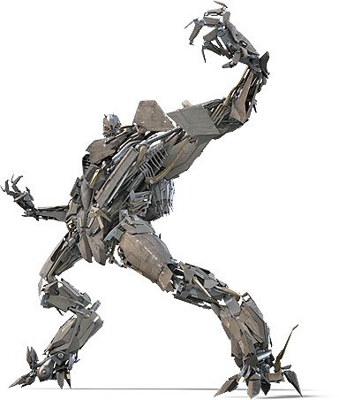
Optimus Prime still looks screwed up. I love how in the 'fun facts' they compare him to King Arthur... yeah, King Arthur is definately the type to be sporting X-treme flames if he was around today...
Posted:
Thu May 10, 2007 9:21 amby OmegaDestroyer
The death of Transformers and the birth of BAYFORMERS!!!!!!:(
Posted:
Thu May 10, 2007 9:27 amby Leonardo
I think some of them would look better if they didn't have such daft poses.
Posted:
Thu May 10, 2007 9:27 amby Psychout
Interestingly, Megatron not only has a half decent (but still evil) face now, but they have even given him the extra 2 finger he had misplaced previously.
Cant wait for this movie, even starscream has portential.
Posted:
Thu May 10, 2007 9:32 amby Rodimus Cloud
Cool, Ironhide looks better then Prime. Starscream is a badass and it reminds me of Skeletor from He-man

Posted:
Thu May 10, 2007 9:34 amby D-340

Wow, Screamer and Megatron don't look like utter crap now. I really like Megs new head, now if his body didn't look like metal spagehtti, he'd be a win. As for Frenzy though...no amount of good looking renders can help that piss poor design. And Prime's pose there just sucks.