Alex Milne updates his DeviantART with Origins #4 line and coloured pages
Wednesday, October 24th, 2007 6:33PM CDT
Categories: Comic Book News, Digital Media NewsPosted by: i_amtrunks Views: 15,259
Topic Options: View Discussion · Sign in or Join to reply
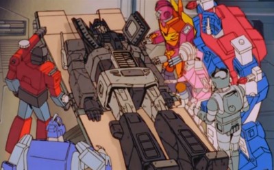
The pages released in both Line and Coloured versions are 6,7,9 and 16.
So check out Alex Milne's DeviantART Galleries for the images.
News Search
Got Transformers News? Let us know here!
Most Popular Transformers News
ROTB Optimus Prime Lead Designer Discusses Why the Face Looks Similar to the 2007 Movie
57,247 viewsMost Recent Transformers News
Posted by dragons on October 24th, 2007 @ 8:31pm CDT
Posted by Dead Metal on October 25th, 2007 @ 1:38am CDT
i_amtrunks wrote:Front Paged and Credited.
Some great work in there, the line art is fantastic, and the colours are suburb Josh, page 16 is some of your best work I have ever seen.
Hell yea, my front page No4!
Thanks
Posted by Cyber-Kun on October 25th, 2007 @ 1:44am CDT
Posted by Leonardo on October 25th, 2007 @ 2:14am CDT
Posted by Black Bumblebee on October 25th, 2007 @ 7:34am CDT
I think everyone involved are doing a superb job, of course, it just doesn't mesh with my eye, personally.
Posted by Leonardo on October 25th, 2007 @ 8:14am CDT
Of course, it's not entirely the colourist[s]'s fault; there are some panels where I wonder what impression Milne was trying to give and I can't always see how the panel composition is telling the story. Megatron's first murder of an Autobot, for example, should have had more resonance in the drawing. Overall, though, I feel murky colouring doesn't mesh well with cramped, detailed pencilling. It seems to me to be a case of two considered ideas that would work well independently, yet when applied in tandem don't support one another very well.
There are, as well, some issues with the writing that really should've been tightened.
Posted by bookofjunon on October 25th, 2007 @ 11:54am CDT
I think it would have been a lot more interesting if there were multiple Decepticon leaders in the past.
Posted by i_amtrunks on October 25th, 2007 @ 6:35pm CDT
Leonardo wrote: there are some panels where I wonder what impression Milne was trying to give and I can't always see how the panel composition is telling the story. Megatron's first murder of an Autobot, for example, should have had more resonance in the drawing. Overall, though, I feel murky colouring doesn't mesh well with cramped, detailed pencilling. It seems to me to be a case of two considered ideas that would work well independently, yet when applied in tandem don't support one another very well.
There are, as well, some issues with the writing that really should've been tightened.
I have to agree here, the colours suit the story well, but the art could have been better.
The story and concept were sound, the writing somewhat disappointing.
Posted by Leonardo on October 26th, 2007 @ 2:19am CDT
i_amtrunks wrote:Leonardo wrote: there are some panels where I wonder what impression Milne was trying to give and I can't always see how the panel composition is telling the story. Megatron's first murder of an Autobot, for example, should have had more resonance in the drawing. Overall, though, I feel murky colouring doesn't mesh well with cramped, detailed pencilling. It seems to me to be a case of two considered ideas that would work well independently, yet when applied in tandem don't support one another very well.
There are, as well, some issues with the writing that really should've been tightened.
I have to agree here, the colours suit the story well, but the art could have been better.
The story and concept were sound, the writing somewhat disappointing.
Yes, the premise was intriguing and the concept, as you say, was good. For me, it was largely the plotting and some of the panel-to-panel writing that were flawed. (I read somewhere that this was cut to four issues from the proposed six that Holmes had pitched to DW, so that might be why.)
And how many times did I feel like using the word 'well' in that quote?
Posted by mechajol on October 26th, 2007 @ 2:57am CDT
dragons wrote:i agree great colors great work on this issue on page 16 looks like a gundam turned into decepticon i watch alot of anime that could be why.
sorry for the off-topic reply, but, dude, your sig is awesome! where can i get a high-res full picture of that? thanks!


