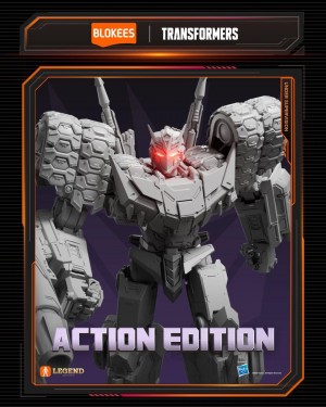
Optimus looks pretty good. I don't know whether it's simply the lighting, but his white looking teeth make a big difference to that face. Have to question why they painted the side windows yellow instead of blue, mind. Definite purchase.
I like that they've put the Ultimate Predaking detail of colours on to the voyager, but I'm still waiting on a review of the Ultimate one before coming to a conclusion as to which version to get. (Ultimate Predaking looks to have such a lazy transformation.)
I'm torn on Shockwave as there's little difference I can see apart from a toned down purple (the armour pieces are insignificant no matter what colour they are). Need in-hand images.
Bumblebee. What about it?
Bulkhead looks
really boring. They could've at least coloured his weapon to give him a
little something.
Wheeljack's pretty boss. I thought the Hasbro version was a bit too busy colour wise, so I like this toned down version.
Starscream looks to have inherited Megatron's colours. Interesting....

Blander colours than the Hasbro one, but so much better.
And I don't know what I've been smoking, but the first thing I thought of when I looked at Soundwave was an Oompa Loompa.

Mkall wrote:I don't see anything here that I don't need. I'll stick with Hasbro's versions of what few characters I want.
Double negative, dude.


