Lord~Megatron wrote:Liege Evilmus wrote:Lord~Megatron wrote:Liege Evilmus wrote:Lord~Megatron wrote:Liege Evilmus wrote:Lord~Megatron wrote:Just a quote from tfw2005's dead end i really agree with him 100%
Style does not denote age. And from the intricacies shown here, the back log of info put into this shows an adherance to all walks of age. A good writer does not need to resort to gritty shock value to be 'adult.'
Titans had a rape episode among other adult nods, Animaniacs was full of adult humor, and even Foster's or JLU had pure adult implied moments.
Which of those is a direct 'adult' toon not aimed at kids?
Yet are still highly entertaining to adults, while having adult stories within the context of what looks like a simplistic 'child's story'.
I can agree with that, it still doesn't change the fact thoug that the LOOK is a silly rehash of this...
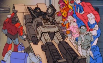
http://www.youtube.com/watch?v=gaBB2w7xrzcCompair the character designs and tell me they aren't very similar.
there not at all its more similar to g1 animation then cartoon networks classic animation. Did you read what i posted and understood all the big word?

I'm an artist myself, and very well educated. We've been civil in our transactions here and I respect you for it, don't make me loss that respect over what someone else wrote.
As I've stated, I liked Teen Titans, it did get old though, because when the stories started to fizzle they started relying to much on the cartoonie edge that initialy was incorporated to enhance certain moods.
That show went down hill when the joke became the norm, and the writing became lax.
Now, keeping in mind that I do have a respect for this animation style. So, I ask you, the drawing that you use for a signature pic is very elaborate and well detailed. The excessive lines add depth, detail, and character, to what is basicly a drawing.
Tell me yes or no, do you think this show would look better if they went the extra mile and incorporated some of those same details to add and enhance these characters?
Keep the style i like it better. My sig was made by girmsqueaker becuase that was the onlything i could think of was at the time. That gobots thing has its own style you can call it similar but they are 2 different types not the same they really dont even look similar at all.The animation in the new transformers animated is my favorite style and comparing it to somthing like that leads me in for the kill.
Do you're best, but your not getting the point, look at the design not the style.
As for me refrencing your sig pic, you use it therefore you must like it, and you can't tell me the details don't make it better than just a flat drawing.
I'm not questioning your tastes or saying that your opinion is wrong. I'm just saying that this same style, as with any style, could and should be improved upon from what was done yesterday. If Teen Titans and Ben10 are great, then this should be astounding!
"Great art is never completed, just abandoned" -LeMerchant
Without evolutions in design and quality, we are only left with the crumbs of both the illustrator, and animators origional ideas.
Yep my sig is great
Hey if thats what you like fine, but you realy should spell check

In all my posts in this thread, I haven't faulted anyone for their oppinion, everyone is welcome to there own. I've even gone to bat for some folks who bashed me.
Still, when this airs, it will be our dollars and channels, that will determine if these designs will be short lived, upgraded, or scraped for the next thing.
I'm hoping for some good stories, I truely am, but still, in the world of film and television, story without quality picture may as well just be radio.
I hope this series does do well, I know that may seem to contradict alot of what I've been saying. But take Beast Wars, and to a (much) lesser extent Armada. For these series to be sucsessful, the image and design HAD to be revised.
This is the first TF series in some time that is being planned with the idea of long term continuation in mind. On that note, the room for improvemnt is there.
But still, after 20+ years of trial and error, one would think they'd start off with the best they could do from the start, and not generic forms.
------------
Also, a full size pic of the animation poster has been posted with Megatron featured. You may be happier with that and using white in your lettering as the purple it tending to blend.


/t-DSC04149.jpg)
/t-DSC00482.jpg)