Delta Magnus wrote:Ah, of course, I forgot that in Japan the G1 line is still technically alive...only much better than the days of conjoined legs and seats for heads.
Of course, the whole "accuracy" argument depends on what they are supposed to be accurate to, the original toyline, the cartoon, one of the various comics, the G1 manga that was exclusive to Japan (no, not Kiss Players), the newer comics, the Headmasters anime, the utterly brilliant Transformers: PD Type manga, etc...
Yeah. Five months ago, TOMY had the G1-verse rebooted for a new generation of fans, and currently have the series published in Kerokero Ace. Many older fans might be turned off by its episodic style, but I find it to be fine and hope that it gets an animated series. Which is a relief, as Hydra was said to have made a statement in regards to Professor Chase... Which has me feeling a bit confused about his own contribution, when it comes to which animated continuity he is using.

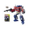
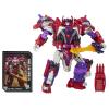
And besides, the new G1 continuity has me opting for TOMY's own "Generations" Ultra Magnus. All-in-all while disputing about getting both Prime and the Combaticons in hope of reenacting the scene that appears to be a "Optimus Prime Vs. Bruticus" event.

Delta Magnus wrote:And then we get into the "Rumble is blue and Frenzy is red" argument...
Yup. I blame Sunbow for that. Because Ralph Maccio (not the Karate Kid) created Rumble and Frenzy, and had it be RIRFIB during the "limited series" portion of the Marvel franchise. Bob Budiansky, who was the editor of the time, continued that fact so things would stay consistent with the toyline. Same with Simon Furman. However, according to unconfirmed stories I have heard, Sunbow thought it might confuse kids... As in seeing Frenzy doing all the rumbling. So they swapped the names for the English dub. Takara, however, kept it consistent with the toyline.
So the answer to that argument is that fans should just stick with the version they like and accept the fact that the rest might not be the same.
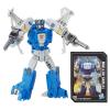
Delta Magnus wrote:Ugh. Myself I actually really like Vortex's new colours. Whilst I do think that it was a bit odd to release 4 of the 5 in G1-ish colours and then completely change Vortex, I think that Vortex's new colours add something to the combined form.
Looking at it again... I do have to agree with you there. If I had the money, and was a hardcore Combaticon fan, I would make a point of having an entire shelf dedicated to their color schemes. Because what many fans did not know is that Takara did just that with both Powered Convoy and the Train Robo sets. And knowing that, it has me appreciate the different incarnations a bit more.
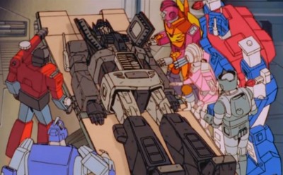
Delta Magnus wrote:I am very glad they gave Blastoff the coppery-gold armour as opposed to the hideous brown of the original toy. Putting aside the fact he was a space shuttle (which was itself rather odd, why didn't they make him a fighter jet or a UAV?) and his colours were not very space shuttle-y, the shade of brown just looked hideous.
I again agree with what you said, for the reasons I said above. However, my only concern is tied to durability more than the color scheme. And with some having hollow backs, it makes me prefer having an ugly color scheme more than knowing how easy it is to break them. But that is me.


 But even then, the set look very nice.