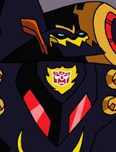
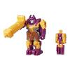
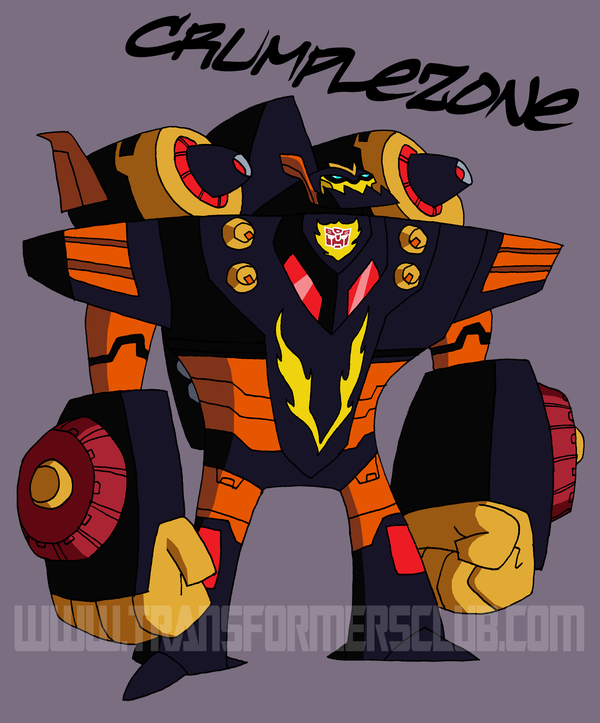
Animated Crumplezone Character Model
Thursday, March 10th, 2011 12:23PM CST
Categories: Comic Book News, Event News, Collector's Club NewsPosted by: El Duque Views: 62,964
Topic Options: View Discussion · Sign in or Join to reply
News Search
Got Transformers News? Let us know here!
Most Popular Transformers News
ROTB Optimus Prime Lead Designer Discusses Why the Face Looks Similar to the 2007 Movie
56,413 viewsMost Recent Transformers News
Posted by T-Macksimus on March 10th, 2011 @ 12:55pm CST
Sabrblade wrote:How can you tell who that is? He looks too weird to be Sandstorm.godzillabot wrote:You’re forgetting Sandstorm Sabrblade! And to quote myself :
“As of yet nobody has commented on the botcon exclusive Sandstorm in the corner, in case you don’t see him he’s right on the panel with the close-up of Cheetor, right near the furthest to the right of his three horns”
He bears about as much resemblance to G1 Drilldasher as he does to Convention Sandtorm so I would definitely have to vote that one 'Inconclusive'.
Posted by UltraPrimal on March 10th, 2011 @ 1:14pm CST
Posted by Diem on March 10th, 2011 @ 1:59pm CST
Sabrblade wrote:Correction:
Page 1Page 2
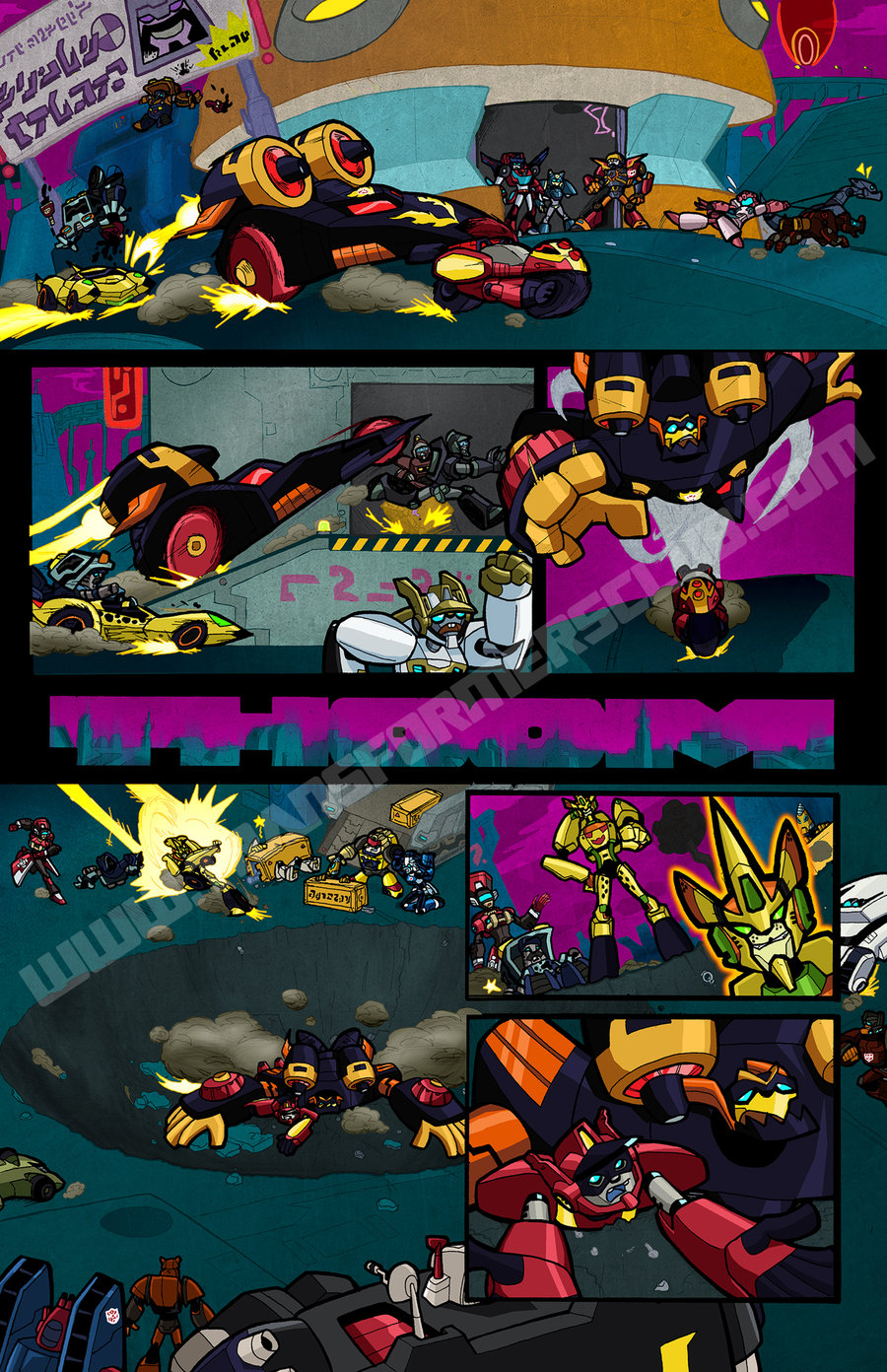
- Motormaster (head, advertisement)
- Huffer
- Pipes
- TransTech Cheetor
- "Dark Crumplezone"
- "Ransack"
- A red Tracks ("Road Rage?")
- Glyph
- A red Hot Shot ("Excellion?")
- Rosanna
- Zaur
- Ramhorn
- Red Project Omega Autobot Worker
- Blue Project Omega Autobot Worker
- Stampy
- A red Red Alert (???)
- An unidentifiable fallen white bot
- A yellow Brawn (???)
- A blue Arcee (Chromia?)
- Tap-Out
- A blue Powerglide w/ a red head (???)
- Volks
- Dug Base
- An Autotrooper
- Chase
- Some blue and red guy with wheels on his shoulders and a face like Wasp's.
- "Jackpot"
- Hubcap
- TransTech Depth Charge
I was waiting for you to show up and set the record straight Sabr.
Posted by Pete@BotCon on March 10th, 2011 @ 3:36pm CST
UltraPrimal wrote:You can tell this guy wasn't designed by Derrick Wyatt.
Actually. He was...
Posted by Jaynz on March 10th, 2011 @ 5:07pm CST
Pete@BotCon wrote:UltraPrimal wrote:You can tell this guy wasn't designed by Derrick Wyatt.
Actually. He was...
It seems to be a little sloppy, I guess, for one of Derrick's designs. It's not bad (though using the less-common Dark Crumplezone scheme was an odd choice), but the lines aren't as clean or nice as most of Derek's other designs have been.
Posted by Mindmaster on March 10th, 2011 @ 5:40pm CST
At the end of the Cybertron series, they musta hit their heads hard when they landed on Mars!
Posted by Destron23 on March 10th, 2011 @ 5:56pm CST
Posted by Carnivius_Prime on March 11th, 2011 @ 2:14am CST
Jaynz wrote:It seems to be a little sloppy
Aren't they all? I assumed the reason Animated uses this 'style' was so little kids with no artistic talent at all could almost accurately draw their favorite characters. I can't think of any other reason why choose such a poor scrappy graphical aesthetic unless the animators themselves lack the skill to do any better too.
Posted by cannonfodder4000 on March 11th, 2011 @ 3:50am CST
Carnivius_Prime wrote:Jaynz wrote:It seems to be a little sloppy
Aren't they all? I assumed the reason Animated uses this 'style' was so little kids with no artistic talent at all could almost accurately draw their favorite characters. I can't think of any other reason why choose such a poor scrappy graphical aesthetic unless the animators themselves lack the skill to do any better too.
Yeah, that's totally the reason.
Posted by Pete@BotCon on March 11th, 2011 @ 8:37am CST
cannonfodder4000 wrote:Carnivius_Prime wrote:Jaynz wrote:It seems to be a little sloppy
Aren't they all? I assumed the reason Animated uses this 'style' was so little kids with no artistic talent at all could almost accurately draw their favorite characters. I can't think of any other reason why choose such a poor scrappy graphical aesthetic unless the animators themselves lack the skill to do any better too.
Yeah, that's totally the reason.
Haters gonna Hate...
Posted by Counterpunch on March 11th, 2011 @ 9:43am CST
Pete@BotCon wrote:cannonfodder4000 wrote:Carnivius_Prime wrote:Jaynz wrote:It seems to be a little sloppy
Aren't they all? I assumed the reason Animated uses this 'style' was so little kids with no artistic talent at all could almost accurately draw their favorite characters. I can't think of any other reason why choose such a poor scrappy graphical aesthetic unless the animators themselves lack the skill to do any better too.
Yeah, that's totally the reason.
Haters gonna Hate...
I asked in the Twitter feed but I don't think anyone noticed...
Why did Crumplezone get his redeco colors and Ransack did not?
Posted by Pete@BotCon on March 11th, 2011 @ 9:46am CST
Counterpunch wrote:
I asked in the Twitter feed but I don't think anyone noticed...
Why did Crumplezone get his redeco colors and Ransack did not?
Not sure. Artist preference I guess... Since it is Animated, you can pick and choose what you homage.
Posted by Pr1meSuspect on March 11th, 2011 @ 7:13pm CST
Posted by El Duque on March 13th, 2011 @ 11:19am CDT
If you want to get a closer look at the Transformers Collectors' Club's two page Botcon preview comic, "Moving Violations", featuring Animated TransTech Cheetor you're in luck. FunPubComics has updated their deviantART account with larger unlettered versions of both pages. The first page has been mirrored below, to see page two visit their deviantART account.
Posted by Pr1meSuspect on March 14th, 2011 @ 7:29pm CDT
This comic brings me a lighter spirit, but also great sorrow. Somehow the new Animated Cheetor is more appealing to me and I might consider buying him. However now I am saddened that they are rubbing Hot Shot in my face and we will probably never get a figure
I'm a 90's kid so Armada came first before I saw the 86 movie. Hot Shot might be my favorite Transformer, in front of Prime, then Shockwave, then Hot Rod. Sorry guys, Hot Shot just stuck out when I was 7.
Posted by cannonfodder4000 on March 27th, 2011 @ 6:20am CDT
Pete@BotCon wrote:cannonfodder4000 wrote:Carnivius_Prime wrote:Jaynz wrote:It seems to be a little sloppy
Aren't they all? I assumed the reason Animated uses this 'style' was so little kids with no artistic talent at all could almost accurately draw their favorite characters. I can't think of any other reason why choose such a poor scrappy graphical aesthetic unless the animators themselves lack the skill to do any better too.
Yeah, that's totally the reason.
Haters gonna Hate...
Didn't notice the italics on totally didja Pete?


