
Gorgeous work, JAF! I've got three main crits, although they're all pretty minor.
a) The smoke, I reckon, looks too smooth; you might do well to try and break it up by stippling a couple of different shades with a smaller 'brush'.
b) I think the buildings behind Hotspot and Blades could do with being a tad less defined; considering how far in the background they are they seem to stand out a little too much. Just a little diffusion should help.
c) Onslaught's purple looks a little too vivid; it ought to be darker and more toward the blue/grey side.
As to your comment about the definition on Bruticus, I have to disagree; I think he's plenty clear enough, and the detailing on him is fantastic.
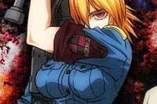
Bruticus
35 posts
• Page 2 of 2 • 1, 2
![]() by TwV » Wed Mar 22, 2006 11:32 am
by TwV » Wed Mar 22, 2006 11:32 am
I have to agree.Ramrider wrote:Gorgeous work, JAF! I've got three main crits, although they're all pretty minor.
a) The smoke, I reckon, looks too smooth; you might do well to try and break it up by stippling a couple of different shades with a smaller 'brush'.
b) I think the buildings behind Hotspot and Blades could do with being a tad less defined; considering how far in the background they are they seem to stand out a little too much. Just a little diffusion should help.
c) Onslaught's purple looks a little too vivid; it ought to be darker and more toward the blue/grey side.
As to your comment about the definition on Bruticus, I have to disagree; I think he's plenty clear enough, and the detailing on him is fantastic.
Also the laser should hit Brute's forearm the way it's angled, and not pass over it.
Still, great job though.
- TwV
- Minibot
- Posts: 105
- Joined: Fri Nov 19, 2004 3:18 pm
![]() by TM JAF » Thu Mar 23, 2006 4:02 pm
by TM JAF » Thu Mar 23, 2006 4:02 pm

Thanks guys. Nice to see you're still checking in Pepie!
a) The smoke, I reckon, looks too smooth; you might do well to try and break it up by stippling a couple of different shades with a smaller 'brush'.
b) I think the buildings behind Hotspot and Blades could do with being a tad less defined; considering how far in the background they are they seem to stand out a little too much. Just a little diffusion should help.
c) Onslaught's purple looks a little too vivid; it ought to be darker and more toward the blue/grey side.
Great points Ramrider, I agree and did all three tweaks, so thanks!
And Billy, I messed around with some alternatives to inking. Cause it would have been a real PITA to do for this one. I scanned the original pencils in B&W then cleaned that up to use in as the alpha channel. Not perfect but it worked with the more painted style I used for coloring.
I'm looking forward to doing some crisp clean drawings that can be more stylized when colored.
Anyhow, thanks again to all.
"Logic is the ultimate weapon."
- TM JAF
- Site Owner
- Posts: 116
- Joined: Tue Sep 14, 2004 5:45 pm
- Location: New York
![]() by Blastoderm » Thu Mar 23, 2006 6:49 pm
by Blastoderm » Thu Mar 23, 2006 6:49 pm
Simply awesome, love the rich colors and the improvements you made to it!:)
And nice to see how well you rendered the smoke, I personally have some trouble painting that type of FX. Xp
And nice to see how well you rendered the smoke, I personally have some trouble painting that type of FX. Xp
- Blastoderm
- Micromaster
- Posts: 76
- Joined: Mon Sep 29, 2003 12:48 pm
![]() by TM Jetstreamx » Tue Apr 11, 2006 1:02 am
by TM Jetstreamx » Tue Apr 11, 2006 1:02 am
Other than your perspective, I would say that you've done a great job on this. I think you've improved a bit since November. ^_^ Great Work!
- TM Jetstreamx
- Mini-Con
- Posts: 12
- Joined: Wed Mar 30, 2005 6:32 pm
- Location: Mississippi
![]() by Hobbyist Prime » Tue Apr 11, 2006 6:48 pm
by Hobbyist Prime » Tue Apr 11, 2006 6:48 pm
That is one incredible piece of work!!!! I think the only thing left is to slightly change first aid in the smoke. After the inking he got a little too distorted I think! I wouldn't change much because he is hidden in the smoke but he just needs a little definition because he hardly looks like a robot! I had almost mistaken him for more debris.
Aside from that though WOW!!!!!!!!!!!!!
Aside from that though WOW!!!!!!!!!!!!!
- Hobbyist Prime
- Targetmaster
- Posts: 618
- Joined: Sun Jun 11, 2006 5:53 pm
35 posts
• Page 2 of 2 • 1, 2
Who is online
Registered users: Apple [Bot], Bing [Bot], ChatGPT [Bot], Google [Bot], Google Adsense [Bot], Google Feedfetcher, MSN [Bot], OpenAI [Bot], Rodimus Prime, Yahoo [Bot], Yandex [Bot]