
Just my thought on it.
![]() by Charger426 » Mon Aug 20, 2007 6:19 pm
by Charger426 » Mon Aug 20, 2007 6:19 pm
![]() by Dispensor » Mon Aug 20, 2007 6:29 pm
by Dispensor » Mon Aug 20, 2007 6:29 pm
![]() by osiricon » Mon Aug 20, 2007 6:39 pm
by osiricon » Mon Aug 20, 2007 6:39 pm
![]() by Charger426 » Mon Aug 20, 2007 6:46 pm
by Charger426 » Mon Aug 20, 2007 6:46 pm
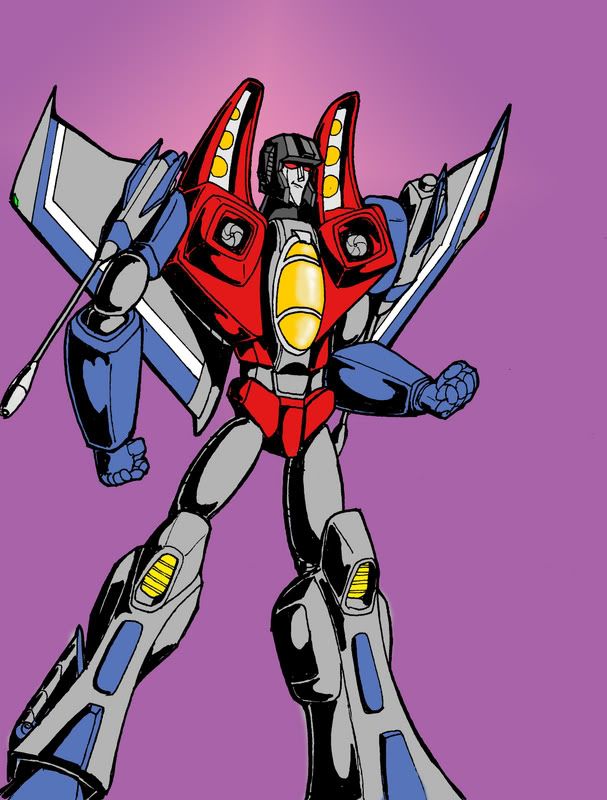
Dispensor wrote:Looks awesome, but the right arm could use some work. The elbow perspective is totally wrong, and the hand looks like the palm is facing the viewer and the fingers are just bent all the way back.
Also, the right thigh should be ad big as the other, and the knee should overlap it,
osiricon wrote:Nice I see you trying more coloring. I like the face,looks like the cartoon version
![]() by Charger426 » Mon Aug 20, 2007 7:00 pm
by Charger426 » Mon Aug 20, 2007 7:00 pm
Dispensor wrote:Looks awesome, but the right arm could use some work. The elbow perspective is totally wrong, and the hand looks like the palm is facing the viewer and the fingers are just bent all the way back.
Also, the right thigh should be ad big as the other, and the knee should overlap it,
![]() by osiricon » Mon Aug 20, 2007 7:39 pm
by osiricon » Mon Aug 20, 2007 7:39 pm
![]() by i_amtrunks » Mon Aug 20, 2007 8:11 pm
by i_amtrunks » Mon Aug 20, 2007 8:11 pm


![]() by Dispensor » Mon Aug 20, 2007 10:21 pm
by Dispensor » Mon Aug 20, 2007 10:21 pm
Charger426 wrote:Dispensor wrote:Looks awesome, but the right arm could use some work. The elbow perspective is totally wrong, and the hand looks like the palm is facing the viewer and the fingers are just bent all the way back.
Also, the right thigh should be ad big as the other, and the knee should overlap it,
Thanks for the tips. Very true, all of it. Its not perfect.
![]() by Burn » Tue Aug 21, 2007 1:22 am
by Burn » Tue Aug 21, 2007 1:22 am
Registered users: Apple [Bot], Bing [Bot], ChatGPT [Bot], Google [Bot], Google Adsense [Bot], MSN [Bot], Nemesis Primal, OpenAI [Bot], ThunderThruster, Yandex [Bot]