
I dont think there has been a thread to this effect. Plenty of discussion in other threads but not a place to state about everything at once. (If I am wrong, posting a link would be awesome)
I am curious about what everyone thought about specific designs(Structure, weapons, altmode, etc) and why.
I'll start.
Favorite: Damn this is harder than I thought. I am going to have to say Megatron because I finally feel like he is Megatron. The jet was wierd but not unheard of(energon), the tank is perfect I think. Big cannon and all the arrogance of hating earth modes.
Least Favorite: The Twins. I understand most of why they did what they did with them. But they are just so ugly and seem out of place with the rest. Also I hate the cars they turn into. The icecream truck was a way better way for them to go.
Favorite/Least Favorite Designs
26 posts
• Page 1 of 2 • 1, 2
Re: Favorite/Least Favorite Designs
Posted by Convotron Wed Sep 23, 2009 11:18 pm
Motto:
"When in doubt, transform and roll out!"
Weapon:
Saber Blade
I'm going to say in the 07 movie, my favourite designs were Optimus Prime, Ironhide, and Brawl. I'm all about big bulky trucky tanky blocky alt modes in this movie for me.
OP's bot mode, however, has tall and athletic proportions, though, which is a nice switch up from the Peterbilt, which isn't as really that stocky anyways, at least not compared to the G1 flat nosed truck. OP reminds me of a basketball player in his bot proportions.
Ironhide looks like a quarterback to me, big and strong but surprisingly quick and agile.
Brawl is simply an awesome tankcon. The bot mode has an unexpected "balanced" look to it. One would think tank alt mod should equal a tanky bot mode. There's a lot of sharp and jagged details, also forearm blades, which is again a bit of a turn on expectations for a character with an alt mode that specializes in ranged attacks.
Least favourites would be Starscream and Megatron.
Starscream looks great in alt mode but the bot mode just seems really bow legged and not aesthetically appealing to me. It's a space Dorito!
Megatron is fine but once I think "Megatron", it just doesn't do it for me. A cool design but not what I would like to see as Megatron.
Now for RotF. My favourites are...Mudflap, Skids, Megatron, and Devastator.
I really like small car alt modes(I'm a big fan of G1 BB and Cliffjumper) and the basic design of the Twins are what I thought would have been great for a more "true" homage to G1 BB in the movies. I'm not a big fan of the characters but the designs I love with the exception of the goofy heads. The bot modes are nice and chunky with broad torsos and larger forelimbs. However, the thinner thighs and upper arms give them an animated feel(not TFA) where the forearms and lower legs are often exaggerated. I like how they mirror each other with different large arms, kind of like crabs.
RotF Megatron is what I would have liked to have seen as the design in the 07 movie. The crab claw/cannon arm is pretty cool and the Cybertronic tank/jet alt mode is ridiculous but in a good way.
Devastator...I think the design is very neat. Very big and imposing and the gorilla-ish body makes it look even more menacing. A giant, angry ogre of a robot. The wrecking balls I could do without but whatever.
Now I'm a G1 fan at heart, I love the big robot aesthetic in anime from the 70s to the 90s. However, I really enjoy industrial and mechanical design so that part of my tastes has helped the movie style really grow on me.
Toys for sale, S.H. Figuarts, Revoltech, Robot Damashii, Figma, and more!
Discounts for purchases of 3 items or more! See sales thread for details.

Never forget the Oath Sworn Through Courage!
Discounts for purchases of 3 items or more! See sales thread for details.
Never forget the Oath Sworn Through Courage!
-
Convotron - City Commander
- Posts: 3399
- News Credits: 2
- Joined: Sat Jul 25, 2009 12:13 am
- Location: Canadia
- Strength: 7
- Intelligence: 7
- Speed: 7
- Endurance: 10+
- Rank: 7
- Courage: 10+
- Firepower: 9
- Skill: 10
Re: Favorite/Least Favorite Designs
Posted by Mythos Wed Sep 23, 2009 11:57 pm
Motto:
"Knowledge is Power...Cannon!"
Weapon:
Static Laser Gun
First Movie
My favorite designs from the first film have to be Blackout and Ironhide. Both were menacing and powerful, and I loved how you can see all of Blackout's helicopter parts in his bot form. I love Iron Hide's design because it reminds me so much of Optimus Primal's first form.
My least favorite has to be Starscream (because his shoulders are too wide and he seems more like a gorilla than a bird to me) and Frenzy who I felt was too comical.
When it comes to the toys, I love love love Salvage's design both in how it transforms and how awesome he looks standing there. A close runner up is Blackout.
RotF
My favorite designs from the movie are the Constructicons. I love industrial machinery, and all of them are radical and menacing. Rampage is a graceful pogostick of death, while Long Haul is a big quarterback of the team. My least favorite design are the Arcees (they kind of neutered her character) and the Fallen because he doesn't live up to his name.
For the toys, I love the redeco of Wreckage called Bludgeon because he reminds me of G2 Megatron and Dinobot fused together. I also love Breakaway and Dune Runner, whose military designs fit with their combat style. I also love Ejector and Ransack because they went for something different and crazy and made it work. Dirt Boss gets an honorable mention because he's a forklift and I consider him an (un)official member of the Constructicons.
My least favorites are Stratosphere because he bows too much from the weight and Sideways for the same problem.
-

Mythos - Mini-Con
- Posts: 45
- Joined: Tue Jul 21, 2009 8:11 pm
- Location: indianapolis, in
- Strength: 4
- Intelligence: 9
- Speed: 7
- Endurance: 5
- Rank: 5
- Courage: 8
- Firepower: 6
- Skill: 10
Re: Favorite/Least Favorite Designs
Posted by shonenfan4 Thu Sep 24, 2009 2:25 am
Weapon:
Fusion Blaster Cannon
Favorite: 2007 Movie Barricade, a Decepticon police car alt mode? It's like the best thing since Terminator 2.
Least Favorite: 2007 Movie + ROTF Scorponok.
Least Favorite: 2007 Movie + ROTF Scorponok.

<GOODBYE CRUEL WORLD>
Haters, you've won.
-
shonenfan4 - Godmaster
- Posts: 1941
- News Credits: 1
- Joined: Tue Jul 21, 2009 9:09 pm
- Location: Shattered Glass Hell
Re: Favorite/Least Favorite Designs
Posted by Joshua Vallse Thu Sep 24, 2009 4:43 am
Motto:
"Build a Giant Robot? Sure it's safe, I mean...it's not like two Stars from a childhood tv show are going to hotwire it and take over the world....right?"
Can of worms can of worms can of worms!!!!!
Tee hee.
Well, I actually like the new movie aesthetic overall in terms of Nizzi and Proctors' designs. It's different, neat, and original. So being I like the overall design style, I'll just concentrate on what I hated in terms of characters.
The Twins,
They will forever earn my undying hatred. In fact I just might buy a damn copy of ROTF just to re-edit it without the twins, and see how much of a better movie it turns out to be. The thing is, all one has to do with the twins is take off their heads....and the design is already greatly improved upon.
Devastator,
I will always proclaim it as Dirt Devils and Vehicle Voltron's bastard son. I mean I can understand designing a gimmick into a character for the sake of plot (A weak plot mind you, but a strippet of a plot), but designing an entire robot around that gimmick? "We need a way to uncover the machine from under the pyramid. So, what if we just make Devastator a giant vacuum? Brilliant, approved, next." Ugh..... And to make it worse it couldn't even kill one single Autobot.
The thing is the size of a @*$&@&@*# oil rig and it can't kill a twin?!?!?! Bunch of A$$clowns I swear...
Arcee,
I'm just counting all three bots as Arcee, simple as that. I mean the other two were pretty much just cannon fodder so why not just simplify this mess. I feel in love with Proctor's first design, then they mucked it up trying to make her a combiner, then they dropped the ideal because I guess they felt like they had too many combiners....accept Devastator wasnt a combiner, so thats just insult to injury. To make things even less appealing they designed each of them as Gizmo Duck but with no symmetry, in contrast I'm really not surprised they didn't receive any screen time.
Starscream.
Best comment so far here was "Space Dorito. There was an alternate head I guessed designed at Hasbro, which was used for the classic color release of this character, they should have stayed with that head design. Also, found this body design as a game exclusive or some jazz of Skywarp. This should have been the first approach to begin with....
http://www.blogcdn.com/www.joystiq.com/ ... nder-3.jpg
Jetfire,
His only purpose in the film truly was to be scrap metal for Optimus' upgrade, and thats pretty sad. When I heard he was in the film, I was excited to see this awesome areal battle between Jetfire and Starscream and the Airforce and Megatron.......what did I get....parachute farts and rust in his "Arse". Sigh...... At least the cane turned into a Axe...a nice bandaid to fix that broken bone no?
Ravage,
Ugh....a cyclops kitty bot, seriously. Ravage actually falls into that awesome general group of characters I hate which are Transformers that don't transform. Into anything!!!! And THEY"RE TRANSFORMERS!!!!!! This isn't the only thing I detest about this thing however, it's also knowing there are good designs which were out there that should have been green lit, dozens of pieces of Concept art have proven this! And yet, still, crap gets green lit instead and we get the shovel end of it. Hell I designed a Black Lion for Voltron I would argue would have made a better Ravage, that or even the green lion. In fact the direction was, Make Transformer looking Lions. Here they are....
http://i303.photobucket.com/albums/nn12 ... tfolio.jpg
http://i303.photobucket.com/albums/nn12 ... enLion.jpg
It's just so frustrating as an artist, to see whats been delivered, and know there was something out there designed that was better, and should have made it. All the more reason I'm eagerly awaiting the concept art book to finally be published. See what could have and should have been. Bastards.
Little Toy Car buggar,
I don't remember it's name, frankly I don't care to remember. Johnny-5 there really isn't a bad gimmick. I liked Frenzy in the pervious film because it felt like this bizarre creature thing that fit. If Johnny-5 was treated as more of a "Creature" instead of a persona I think I would have been able to digest it better. Even then, the design is horrible, but I think just a last minute thing per request of the marketing committee, "We need one more toy gimmick, with wheel feet. Because thats the theme of this film, wheel feet in the desert. Good stuff, okay so what do we got, a bug eyed Wall-E carbon copy. Good, kids liked Wall-E. Brilliant, approved, next."
So the gist, pretty much all the new designs for ROTF. Wow, how disheartening. Again I luved the designs for the first film, especially Megatron with his dual arm cannon deal. Luv that waaaayyyyyy above the Davy Jones Crab Arm of death. Even in ROTF I luved Sideswipe, the only bot to pull off the wheel feet gimmick. Enjoyed all 3 seconds of Jolt. Most of what I saw of the Constructicons were good. And thats about it really. Didn't see enough of the rest to really make any type of comment, or just mentally blocked the rest out at this point.
Alright, thats it for now.
Laters,
Josh
CLICK HERE: http://youtu.be/WM394EfR2hk
To see what happens to our two troublemakers. So much for my motto!
Also Visit my website for more artwork:
http://joshuavallse.blogspot.com/
http://www.wix.com/JoshuaBallze/Art-Website/
-

Joshua Vallse - Headmaster Jr
- Posts: 506
- Joined: Wed Jun 24, 2009 1:14 am
- Location: Cali
Re: Favorite/Least Favorite Designs
Posted by YRQRM0 Mon Sep 28, 2009 7:09 pm
I love so many of the designs, I'm gonna have to break this up into a lot of categories.
First Movie
Autobots: Gosh, I love them all. I love Jazz's weapons, head, and slick body look. Ironhide looks totally buff, and I'm all for the tanky bulky mean tough look as well, so he's awesome. BB's design is cool, the wings are awesome I think. Optimus is just perfect. The placement of the llights, silver metal, and all his moving parts is awesome. And his axes look beast the way they glow. Ratchet is awesome, just not as jumpy as the others.
Cons: Brawl, Blackout and Bonecrusher are probably my favorites. Bonecrusher has a cool color scheme, and the way he skates is awesome. I love how solid his head and chest are like he's ready to bust up anything. Blackout and Brawl are so heavily weaponed....and that's pretty much all they need to make them cool in my book.
Second:
Autobots: All but the twins, which I don't mind entirely except their corny humor ruined too many otherwise good action scenes. Arcees are awesome, the way they roll around and stuff. Sideswipe is a beast, proven by his Shanghai entry. Jolt has a cool design too, even though we hardly got to see him. Jetfire is pretty cool, somthing about the face kinda turns me off but I still think he's awesome.
Cons: DEMOLISHER! I LOVED his design! It's so simple, yet it's ferocious! The way he just runs over everything! Longhual has that big solid look like Brawl, which I love. Devastator is awesome too, except the balls of course. Megatron's new design was terrific too.
-

YRQRM0 - Gestalt Team Leader
- Posts: 997
- News Credits: 1
- Joined: Sat Nov 01, 2008 6:26 pm
- Strength: 6
- Speed: 6
- Endurance: 10
- Rank: ???
Re: Favorite/Least Favorite Designs
Posted by Optimist Prime Wed Sep 30, 2009 8:00 pm
Motto:
"One shall stand, one shall fall."
Weapon:
Static Laser Gun
Is it taboo to say they are all awful?
-

Optimist Prime - Headmaster Jr
- Posts: 518
- Joined: Tue Oct 30, 2007 7:19 am
- Location: Iacon
- Strength: 7
- Intelligence: 8
- Speed: 8
- Endurance: 7
- Rank: 5
- Courage: 8
- Firepower: 7
- Skill: 7
Re: Favorite/Least Favorite Designs
Posted by Rodimus_light Thu Oct 01, 2009 1:21 am
Optimist Prime wrote:Is it taboo to say they are all awful?
No, everyone's opinion counts. But I disagree
- Rodimus_light
- Minibot
- Posts: 147
- Joined: Tue Jun 02, 2009 2:29 am
Re: Favorite/Least Favorite Designs
Posted by Nemesis Hacker Thu Oct 01, 2009 7:26 am
07 Movie
Blackout, he is like the juggernaut of the decepticons
ROTF
Megatron - Tank is Aweswome
Demolisher - I have loved wheelbots ever since BM Thrust
Devastator - AWESOME design
Rampage - Bouncy Bouncy
Even though im a decepticon guy i did like the twins, arcee and sideswipe
Blackout, he is like the juggernaut of the decepticons
ROTF
Megatron - Tank is Aweswome
Demolisher - I have loved wheelbots ever since BM Thrust
Devastator - AWESOME design
Rampage - Bouncy Bouncy
Even though im a decepticon guy i did like the twins, arcee and sideswipe
-

Nemesis Hacker - Fuzor
- Posts: 229
- News Credits: 2
- Joined: Fri Feb 16, 2007 9:29 pm
Re: Favorite/Least Favorite Designs
Posted by Grendel Thu Oct 01, 2009 8:35 pm
movie #1
liked: Optimus, Bumblebee, Barricade, Blackout, Ironside, Jazz, and Ratchet, they were all pretty bulky, and bumblebee did manage t have more of a oldier look to him than I thought he would, optimus is athletc looking like's been said, and blackout was just a huge wrecking machine.
disliked: Starscream, space dorito with chicken legs and an anus for a face. Megatron, it was, okay, nothing really great though. Skorponok, meh. Frenzy, looked like a semi-humnoid pile of forks, and the only was he could have transformed into a cd player or cell phone was mass displacement, Bay said there would be no mass displacement, so meh, I liked Frenzy's personality, just not his design
movie # 2
liked, same ones as before, same reasons, Megatron actually looked more powerful, like Megatron should, the constructicons, sideswipe, I honestly liked the arcee's and wish they had more screentime, liked Devastator, because he was huge and ogre-like, liked Ravage, and didn't mind Wheelie
disliked; the twins, forget their jokes and personality, they looked terrible, especially with their heads, just fugly. the Fallen was just not impressive, kind of 'meh' Jetfire i'm 50/50 on, i sort of like, sort of hate
- Grendel
- Fuzor
- Posts: 291
- Joined: Sun Feb 16, 2003 12:39 am
Re: Favorite/Least Favorite Designs
Posted by Jacob P. Galvatron Sat Oct 03, 2009 5:18 pm
Motto:
"Decepticons, till the day I die! West side!"
Weapon:
Big Cannon
Favs:
Optimus
Bumblebee
Megatron
Sideswipe
...
Starscream... *flinches*
Optimus
Bumblebee
Megatron
Sideswipe
...
Starscream... *flinches*

- Jacob P. Galvatron
- Transmetal Warrior
- Posts: 872
- News Credits: 6
- Joined: Fri Oct 24, 2008 5:15 am
- Location: Martha Stewart's house
Re: Favorite/Least Favorite Designs
Posted by Carriemus Prime Tue Oct 06, 2009 4:46 am
Motto:
"I want to be remembered when I'm dead. I want books written about me. I want songs sung about me. And then hundreds of years from now I want episodes of my life to be played out weekly at half past nine by some great heroic actor of the age."
Weapon:
Twin Sonic Cannons
Favourites...
Optimus, Ironhide, Starscream,(I'm sorry but I like the tattoos in movie 2)
Blackout and Barricade... oh and Soundwave
Least Favourites...
Megatron... couldn't look more freaky looking if he tried, Frenzy, the twins and the femme bots
Optimus, Ironhide, Starscream,(I'm sorry but I like the tattoos in movie 2)
Blackout and Barricade... oh and Soundwave
Least Favourites...
Megatron... couldn't look more freaky looking if he tried, Frenzy, the twins and the femme bots
Fanfics:Cave In with HK + Shattered Glass
hellkitty wrote:Ah yes. The Ladies Thread: warning: males entering the dreaded and estrogen-drenched domains of the Ladies Thread shall be subjected to slash references, randomness, hugz and apparently, now, sexual harassment.
Burn wrote:Name_Violation wrote:if you keep writing slash you'll get hairy palms and go blind
The man is wise.
Of course wisdom often comes from experience.
-

Carriemus Prime - City Commander
- Posts: 3154
- Joined: Fri Jul 17, 2009 7:33 pm
- Location: the back of beyond
- Strength: 6
- Intelligence: 8
- Speed: 10
- Endurance: Infinity
- Rank: ???
- Courage: 10+
- Skill: Infinity
Re: Favorite/Least Favorite Designs
Posted by Metal Monkey Tue Oct 06, 2009 7:46 am
I like how things transformed. More realistic. Understandable they had to change a few things, but almost every one of them was changed to the point of retardation. Only thing that stays the same in the movies that I liked is Optimus's general head. Aside from the part of him having a pointy nose. I like Ironhide because he kinda fits better than being a van, but I am really torn about the black. It does work though. Bumblebee.....I wanna slap Bay for that. Ratchet...a search and rescue?? *SLAP*. Optimus is only a favorite because...he is just that, Optimus Prime. Brawl was by far one of the best. I can't comment on seeker jets, because there wasn't any really. They really killed Starscream for me. Megatron...wow. Cyclops Ravage..ewww Soundwave...sigh. I honestly rather watch youtube stopmotion G1's as a replacement. I was excited about the first movie. I was so warm inside. Now instead of seeing the 3rd one or buying ROTF movie, I will just put money towards MP molds and the nice G1 cartoon box sets. All in all, Bay pretty much ruined Transformers on the big screen for me. Not to mention to much of Megan Fox. I thought it was suppose to be a Transformers movie, not a myspace video. I'd rather see Arcee naked to be honest.
-

Metal Monkey - Micromaster
- Posts: 65
- Joined: Mon Oct 05, 2009 10:19 pm
Re: Favorite/Least Favorite Designs
Posted by SentinelA Sun Nov 08, 2009 7:38 pm
07 Movie
Fav: Optimus Prime
Worst: Starscream
ROTF
Fav: Megatron
Worst: Jetfire
Keep in mind that I'm comparing w/ G1
Fav: Optimus Prime
Worst: Starscream
ROTF
Fav: Megatron
Worst: Jetfire
Keep in mind that I'm comparing w/ G1
- SentinelA
- Headmaster
- Posts: 1000
- Joined: Sun Jul 20, 2008 1:47 pm
Re: Favorite/Least Favorite Designs
Posted by SlyTF1 Mon Nov 09, 2009 8:14 am
Motto:
"If my first sacrifice wasn't enough, maybe you would prefer to pay with your funky blood."
Weapon:
Sword
Devistator, ROTF Megatron, Optimus, Sideswipe, Jolt, and Starscream, I like the way they designed Starscream's mouth, how there is like a triangular peice with strings attached to another triangular peice, so that his mouth never opens, it just streatches out.
Devistator, combined mode- the end
ROTF Megatron, I love his claw gun! Love his tread feet!
Optimus, Love his transformation gives me chills every time
Sideswipe, love the wheel feet, love the swords, and wings
Jolt, Love the translucent and electric parts
Jetfire, Love the back
Worst: Twins, they just seem too plain for a movie design
I Am.
-

SlyTF1 - Faction Commander
- Posts: 4759
- News Credits: 37
- Joined: Thu Oct 22, 2009 10:34 am
- Location: The Kingdom of Heaven
- Alt Mode: The entire universe
- Strength: Infinity
- Intelligence: Infinity
- Speed: 10+
- Endurance: 9
- Rank: 10
- Courage: 8
- Firepower: Infinity
- Skill: 10+
Re: Favorite/Least Favorite Designs
Posted by Demonicus Wed Nov 11, 2009 8:09 pm
I liked most of the designs actually. So it is easier for me to say what I didn't like.
-The twins- character development aside, they are way too goofy looking in my opinion.
-Wheelie- again, too goofy
-Starscream- I too am not a fan of the body proportions here. I actually read somewhere that he was designed in such a way that he wouldn't dwarf the other bots. People don't realize how big a fighter jet is (some 60 feet long) and the only way to make a bot that didn't tower over the likes of Megatron and Optimus Prime was to make him almost as wide as he is tall.
-

Demonicus - Mini-Con
- Posts: 34
- Joined: Sun Jul 12, 2009 1:44 pm
Re: Favorite/Least Favorite Designs
Posted by Prime Riblet Fri Nov 13, 2009 9:12 am
Motto:
"Mottos! We need no stinking mottos!"
Weapon:
Double-Barreled, Armor-Piercing Particle Beam Cann...
07-Barricade. "to punish and enslave" pretty much says it all.
RoTF-Optimus Prime. He was just awesome. I would say Sideswipe, but 2 minutes of screen time is just a joke. I can't believe the Twins got that much screen time. What a total waste of CGI when there's a ton of things they could have done with the rest of the Autobot characters. So disappointing.
RoTF-Optimus Prime. He was just awesome. I would say Sideswipe, but 2 minutes of screen time is just a joke. I can't believe the Twins got that much screen time. What a total waste of CGI when there's a ton of things they could have done with the rest of the Autobot characters. So disappointing.
-

Prime Riblet - Gestalt
- Posts: 2084
- Joined: Mon Jan 12, 2009 3:08 am
- Location: Rochester, MN U.S.A.
- Strength: ???
- Intelligence: 7
- Speed: 4
- Endurance: 8
- Rank: 6
- Courage: 8
- Firepower: 9
- Skill: 7
Re: Favorite/Least Favorite Designs
Posted by TRANS+CRAZY Sun Nov 15, 2009 1:51 pm
Hmm... my favorite and least favorite Movie designs.
2007 Movie:
Autobot: Optimus Prime
Decepticon: Barricade -- sweet alt-mode and a bad-ass robot mode combined makes him my #1 favorite Decepticon
ROTF:
Autobot: Sideswipe -- damn, he IS good!
Decepticon: Ravage -- two words... BAD KITTY!
2007 Movie:
Autobot: Optimus Prime
Decepticon: Barricade -- sweet alt-mode and a bad-ass robot mode combined makes him my #1 favorite Decepticon
ROTF:
Autobot: Sideswipe -- damn, he IS good!
Decepticon: Ravage -- two words... BAD KITTY!
-
TRANS+CRAZY - Fuzor
- Posts: 265
- News Credits: 1
- Joined: Mon Oct 22, 2007 11:32 am
- Location: In Michigan... just minutes away from towns you've never heard of before...
Re: Favorite/Least Favorite Designs
Posted by Jaw Crusher Sun Nov 22, 2009 5:18 pm
Weapon:
Mace
TF '07
FAVES:
* Bumblebee, Optimus, Ironhide and Jazz.
* Blackout, Barricade, Starscream and Bonecrusher.
NOT-SO-FAVES:
* Ratchet (mostly because of his colors).
* Scorponok (we never see a robot mode to speak of), Frenzy, Megatron (walking jagged metal? Eesh!) and Brawl.
ROTF
FAVES:
* Sideswipe, the she-bikes, and Jetfire (IMO the cane was a nice touch).
* Pretty much all the new Decepticons (even Devastator, in spite of his 'anatomy') and Megatron 2.0.
NOT-SO-FAVES:
* Wheelie and the Twins.
FAVES:
* Bumblebee, Optimus, Ironhide and Jazz.
* Blackout, Barricade, Starscream and Bonecrusher.
NOT-SO-FAVES:
* Ratchet (mostly because of his colors).
* Scorponok (we never see a robot mode to speak of), Frenzy, Megatron (walking jagged metal? Eesh!) and Brawl.
ROTF
FAVES:
* Sideswipe, the she-bikes, and Jetfire (IMO the cane was a nice touch).
* Pretty much all the new Decepticons (even Devastator, in spite of his 'anatomy') and Megatron 2.0.
NOT-SO-FAVES:
* Wheelie and the Twins.

- Jaw Crusher
- Combiner
- Posts: 491
- Joined: Mon May 26, 2003 2:14 pm
- Location: Shelby, IA USA
- Alt Mode: Land Shark
- Strength: 8
- Intelligence: 7
- Speed: 5
- Endurance: 10
- Rank: 5
- Courage: 8
- Firepower: 5
- Skill: 5
Re: Favorite/Least Favorite Designs
Posted by cybercat Sun Nov 22, 2009 7:19 pm
Okay, I totally get the Space Dorito hatred for Starscream, and I admit that I was like 'pause the movie and yell' upset when I saw his design in 07 (see, I was so sure I'd be upset at something in that movie, I waited til DVD so I didn't disrupt an entire theater!). Now, he's really grown on me. He's actually my favorite Starscream design. Rowr. (I am a hardcore fangirl, sorry.) (As the avatar might give away).
Other faves: BLACKOUT. Woof.
Barricade: His mouth is weird, but I like him simply to rescue him from all the bad slashfic out there that has him wanting Sam. BLeurk!
Ironhide: Yeah, I really like his Bay design.
Least Faves:
Bumblebee: DUDE What the HELL is that on his mouth? A ball gag?! Every time I look at his face he creeps me out with those big staring naked blue eyes and the gag thing. Cripes! For months I flinched every day coming to Seibs b/c he was on the banner. (Notice how it stopped me?)
ROTF Megatron. Convotron, the glorious, is right in many respects about the coolness of this design, but the feet, man. The feet kill it for me. If you watch, he can barely actually *walk*. It would be cool if he'd used the treads to sort of motor around, but as walking things...no way. Hideous.
Jetfire: Yeah, this one the Weird Beard got me. He looked like an friggin anchovy with legs.
AND the twins. 'nuff said.
HK, I likes the pretty aircrafts.
-

cybercat - Gestalt
- Posts: 2039
- News Credits: 1
- Joined: Mon Feb 02, 2009 1:33 pm
- Location: lost in cyborg theory
Re: Favorite/Least Favorite Designs
Posted by Optimist_Prime Mon Nov 23, 2009 11:35 am
My favorite designs so far have definitely been Blackout, Barricade, Bonecrusher, Commander Doom Wheels (Demolisher), Long Haul, Prime, and TFTM Megatron. I know a lot of people didn't like his first alt. mode, but there is something I just find awesome about it. I liked even more after I got the Target ornament that of his alt. mode that's in scale with 3" titaniums.
Yeah, he reminds me of the Fox NFL Robot.
My least favorite have to be wannabe Grindor, Sideways, on screen Devastator, the Primes/Fallen, and ROTF Starscream. They're tag line isn't "robots in disguise" just because it's catchy. What they w/ ROTF SS is take out one of his most fundamental elements from TFTM.
Convotron wrote:Ironhide looks like a quarterback to me, big and strong but surprisingly quick and agile.
Yeah, he reminds me of the Fox NFL Robot.
My least favorite have to be wannabe Grindor, Sideways, on screen Devastator, the Primes/Fallen, and ROTF Starscream. They're tag line isn't "robots in disguise" just because it's catchy. What they w/ ROTF SS is take out one of his most fundamental elements from TFTM.
"We don't stop playing because we grow old; we grow old because we stop playing." - G. Stanley Hall, Unsourced variant
-

Optimist_Prime - Targetmaster
- Posts: 698
- News Credits: 1
- Joined: Fri Feb 02, 2007 10:08 pm
- Location: The town you drove through, NH
Re: Favorite/Least Favorite Designs
Posted by Prime Riblet Sat Nov 28, 2009 8:43 am
Motto:
"Mottos! We need no stinking mottos!"
Weapon:
Double-Barreled, Armor-Piercing Particle Beam Cann...
I will say Ironhide looks great as a character in the movie(s) as well as in action figure form. A lot of people say negative things about the IH figure, but That thing is badass IMO. I won't buy the latest iteration of him, since I have the 07 Premium and the Offroad versions. He is awesome though. I love that sucker.
-
Prime Riblet - Gestalt
- Posts: 2084
- Joined: Mon Jan 12, 2009 3:08 am
- Location: Rochester, MN U.S.A.
- Strength: ???
- Intelligence: 7
- Speed: 4
- Endurance: 8
- Rank: 6
- Courage: 8
- Firepower: 9
- Skill: 7
Re: Favorite/Least Favorite Designs
Posted by agentdc7 Sat Dec 26, 2009 11:44 pm
I'm rather picky on designs, but I'll try to be nice
Favorite:
Ironhide - I like his bulky look and cannons, even if he doesn't resemble his G1 Sienna counterpart.
LongHaul - Reminds me of Juggernaut from X-men. Big chunky monster.
Prime - I'm glad he at least resembles his original self compared to all the others. The flames don't really need to be there though.
Blackout - big and menacing. His face looks great too.
Mixmaster - I like the shield arms.
Least:
The Twins - everyone already said enough about them, so i won't add to it.
Arcee(s) - I'm just not feeling the gizmo duck designs.
Starscream - he looks like a frog. I could think of better designs. That example that Vallse pointed out looks pretty good.
Jolt - I just really don't like his face. Nor his alternate mode.
Frenzy - a walking stick. None of his parts ever resemble the form he is replicating.
Decepticon faces - Almost all of them look the same. The same old expanding from the center like a star. It looks cool on a few of them, but it gets old.
I'm gonna add a few nitpicks of mine:
Nitpicks:
Devastator - I'm not saying I'm hated his design. I just felt neutral when I saw it. They could have done without the rainbow color scheme. After all, most construction vehicles I see are yellow and orange. Dev. was one of my favorites and I guess I was expecting too much from his design. Also, his parts don't make sense:
1. well all know the testicles don't come from any part of the 7 vehicles.
2. where does the shovel left hand come from? It's a crane.
3. The legs seem too different in size in terms of the vehicles.
Bumblebee - I like his robot look. I just wish he was a smaller car like the Twins. To me he never fitted as a Camaro. The "baby" of the family being a muscle car... while the 1st Lieutenant is a dinky Pontiac Solstice
Recycling - I still get upset at all the Decepticon recycling in ROTF (Blackout, protoforms, Fallen's comrades w/ slight facial additions, constructicons). They could have put in some other cool designs, but I guess they ran out of time and money (more like 3d animators asking for too much I guess)

-

agentdc7 - Mini-Con
- Posts: 43
- Joined: Wed Jul 22, 2009 5:02 pm
Re: Favorite/Least Favorite Designs
Posted by Rial Vestro Sun Dec 27, 2009 6:31 pm
My favorite designs are so few.
From the first movie... Optimus Prime (earth mode) and Barricade. From ROTF I like Sideswipe and that's about it. Why I like these designs? Because they're the only ones that look real to me.
I hate all the other designs because they don't look like Transformers, they look like robots that shouldn't be able to transform at all. Bumblebee for example, once he's in robot mode the only car parts visable anywhere on his body are the doors, front grill and headlights on his chest, rear license plate, and his tires. The rest of the car completly dissapears as if it never exsisted at all.
I think the whole point of creating a live action version of Transformers should of been to create more realistic transformations not less realistic. In the other series the only thing that dissapears is the car's interrior. At least we still get more accurate toys of them even though their robot parts are shoved in where the interrior of the car should be but the movie designs do that to and most of them end up with vehicle kibble that's never even seen on screen in their robot modes which is why I think the toys actully look better than their movie designs.
My idea of a realistic movie design are the ones which require the least amount of cheating and still provide the most screen accuracy. And what I really wish the designs were, toys like the Alternators that allready have interiors and are even more accurate to the character.
Most of the movie designs fail to even look recognizable as a transformer. Optimus Prime was one of the few that was nicely reimagined. Megatron however I wish had the head of the Wreckage mold which Wreckage actully looks like G1 Megatron. I allso wish Starscream had the head mold of Thudercracker and Skywarp or was renamed to the character he actully looks like, Waspinator. Granted Starscream possessed Waspinator in an episode of Beast Wars but I doubt they gave him Waspinator's head intentionally to please a few Beast Wars fans.
Overall though I tend to go with the head designs that don't make me want to punch the characters. Jazz actully had a preddy nice head sculpt as well as Sideswipe and Jolt. Everyone else however I'd just like to rip their heads off. Bumblebee isn't recognizable either way but he does look more acceptable with his battle mask on. With it off it looks like he's damaged.
Barricade allthough I like his body design I never got the toy and never will because of the ugly head sculpt but if they remolded the head to look more like Prowl I would get him.
I do have several other movie designs which I don't like just because they go in my colection or it's Bumblebee who's special as being my favorite G1 character and first Transformer I had as a kid. I don't have the original anymore but yeah I got the Legacy Bumblebee 3 pack and Human Alliance Bumblebee just for the nastalga not for the design. Allthough in toy form the only annoying part is that damn fake licence plate on his crotch.
Two toys I did buy purely because I like the design. Delux and Human Aliance Sideswipe. Optimus Prime I allso would of got for design as well as the fact that he belongs on my Prime Shelf. Jetfire however even though he combines with Prime I find rather ugly allthough the combined form I rather like. (except for no leg articulation.)
So to recap... Optimus Prime and Sideswipe are my favorites with Barricade just barely makeing the list short of a decent head sculpt.
Everyone else is in varrious stages of ugly.

- Rial Vestro
- Headmaster Jr
- Posts: 546
- Joined: Sun Apr 26, 2009 1:12 am
Re: Favorite/Least Favorite Designs
Posted by Exic Thu Dec 31, 2009 8:50 pm
Favourite: Optimus Prime, Sideswipe, Long Haul, Mixmaster
Least Favourite: Devastator and the Twins
I still like the twins but of course not really much on the design.
Devastator got 2 unnecessary silver "thing" which is one of the reason that makes it's design the least favourite.
Least Favourite: Devastator and the Twins
I still like the twins but of course not really much on the design.
Devastator got 2 unnecessary silver "thing" which is one of the reason that makes it's design the least favourite.
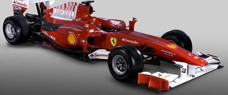
Transformer disguise in Ferrari F10
-

Exic - Fuzor
- Posts: 278
- Joined: Wed Dec 30, 2009 10:34 pm
- Location: Singapore
26 posts
• Page 1 of 2 • 1, 2
Who is online
Registered users: Apple [Bot], Bing [Bot], ChatGPT [Bot], Glyph, Google [Bot], Google Adsense [Bot], MSN [Bot], OpenAI [Bot], Yahoo [Bot], Yandex [Bot]