Pyrostrata wrote:Naw...Not the reason I didn't like this one....I read it a couple times, trying to truly understand it, and I failed...It made no sense whatsoever to me...
Well... many of the Mosaics lately have been too wordy for me. They've got great concepts, but it gets buried under too much exposition. They would read just fine in normal prose but are just a bit too verbose for comics and don't let the art carry enough of its own weight.
I prefer Mosaics like this... the writing is just enough to suggest the story's concept without beating you over the head with it. (And I'm envious of people who can draw *and* write. I can barely write, and you can forget about drawing.)
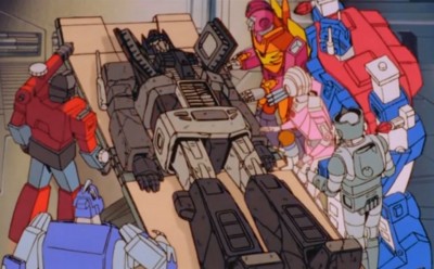
Pyrostrata wrote:The art was decent, but I have seen better (the pic of Prime is good, but the art with all the Autobots was a bit primary and kindegarteny to me)...
And my weird tastes in art rise their head again.

The realistic art in this piece is very nice and I think it was necessary (Tracks' face and the skyscraper, particularly). But... I find deep down the panel you hate is the one I love the most, because it feels the most like it has the artist's *character* in it. It's bright, stylistic, and unique while still being accurate to the designs.
"Realistic art" *is* pretty, but it always feels sterile and generic to me. I prefer idiosyncratic/quirky styles. Unfortunately, everyone else seems to prefer the realistic stuff. :/



 [ Click to attempt signal recovery... ]




/t-DSC00713.jpg)
/t-DSC16796.jpg)
/t-DSC06114.jpg)

/t-DSC00272.jpg)
