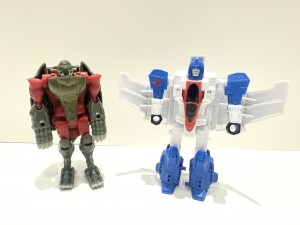
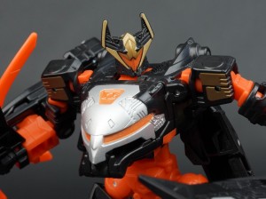
This project was an absolute monster. Pilot was brought in about 18 months before the movie came out. Though well into the design phase of all the Transformers characters, none were completed. We were working with concepts, designs, information, and deadlines that were constantly changing. It was an amazing challenge that we all rose to in typical Pilot fashion. We were brought in for everything, a total overhaul and rebrand of a toy line plagued with different packaging styles for a decade. We were tasked with uniting them under a single, new, and simplified Transformers banner and provide all designs and illustrations to go with it.
Transformers: Age of Extinction Package Art Design by Gregory Titus
Posted by Va'al
Dec 27, 2014 at 11:14am CST
148,687 views
View Discussion
Sign in
or
Join
to reply
More Bots. More News. More Awesome.
Re: Transformers: Age of Extinction Package Art Design by Gregory Titus
(view post)
Comment by william-james88
Dec 27, 2014
These are great!
Re: Transformers: Age of Extinction Package Art Design by Gregory Titus
(view post)
Comment by shajaki
Dec 27, 2014
i love seeing the art behind the art. thats what was one of the best things about collecting comics, most high "incentive variant" covers were sketch versions of the normal covers. so cool to see.
Re: Transformers: Age of Extinction Package Art Design by Gregory Titus
(view post)
Comment by Megatron Wolf
Dec 27, 2014
the ones of drift & crosshairs with their weapons out are awesome, they should've used those instead of the stupid "im running towards you" crap.
Re: Transformers: Age of Extinction Package Art Design by Gregory Titus
(view post)
Comment by Evil Eye
Dec 27, 2014
The art is really nice, but when you manage to get a freakin' BRACHIOSAURUS doing the "Dreamwave Purse-Grab" pose...
Re: Transformers: Age of Extinction Package Art Design by Gregory Titus
(view post)
Comment by chuckdawg1999
Dec 27, 2014
I wonder what was up with them doing a G1 style Prime. If time was an issue wouldn't that be considered a waste.
Re: Transformers: Age of Extinction Package Art Design by Gregory Titus
(view post)
That was done for the Evolution 2-pack.
Comment by Jelze Bunnycat
Dec 27, 2014
chuckdawg1999 wrote:I wonder what was up with them doing a G1 style Prime. If time was an issue wouldn't that be considered a waste.
That was done for the Evolution 2-pack.
Re: Transformers: Age of Extinction Package Art Design by Gregory Titus
(view post)
Ahhh. Perfect sense. Onto another topic, anybody else think the last wave of Power Battlers featuring Junkheap, the Vehicon, and High-Octane Bumblebee will be canceled?
Comment by chuckdawg1999
Dec 27, 2014
JelZe GoldRabbit wrote:chuckdawg1999 wrote:I wonder what was up with them doing a G1 style Prime. If time was an issue wouldn't that be considered a waste.
That was done for the Evolution 2-pack.
Ahhh. Perfect sense. Onto another topic, anybody else think the last wave of Power Battlers featuring Junkheap, the Vehicon, and High-Octane Bumblebee will be canceled?
Re: Transformers: Age of Extinction Package Art Design by Gregory Titus
(view post)
Comment by BeastProwl
Dec 27, 2014
I thought that Galvatron was Gipsy Danger 
Re: Transformers: Age of Extinction Package Art Design by Gregory Titus
(view post)
Comment by Sabrblade
Dec 27, 2014
So much of the same running pose.
Re: Transformers: Age of Extinction Package Art Design by Gregory Titus
(view post)
Comment by monstrinhotron
Dec 28, 2014
yuck. Everyone looks like they have one leg! The silhouette is the most important part of any character art and it's horrible in almost all of these images. Secondly the light source is flat and diffuse meaning it's even harder to make out what the hell is going on with the one giant leg pose. Thirdly the pose is so twisted and EXTREME!! it's just a mess. Usually i give character artists credit because even bad character art is a hard skill to master but i honestly and genuinely could do this much better. simply horrible.
Re: Transformers: Age of Extinction Package Art Design by Gregory Titus
(view post)
Comment by shajaki
Dec 28, 2014
you think this is bad art because of the pose theyre in? you konw that hasbro likely says "do it like this" right? you can do it better, then lets see.monstrinhotron wrote:yuck. Everyone looks like they have one leg! The silhouette is the most important part of any character art and it's horrible in almost all of these images. Secondly the light source is flat and diffuse meaning it's even harder to make out what the hell is going on with the one giant leg pose. Thirdly the pose is so twisted and EXTREME!! it's just a mess. Usually i give character artists credit because even bad character art is a hard skill to master but i honestly and genuinely could do this much better. simply horrible.
Re: Transformers: Age of Extinction Package Art Design by Gregory Titus
(view post)
I don't even like the AOE character design, and I think this art looks GREAT. Those poses are really dynamic. Maybe the one legged pose leaves space on the card so the blister doesn't cover all the art.
If you are going to make this statement, lets have proof. Show us your PUDDING.
Comment by Cobotron
Dec 28, 2014
monstrinhotron wrote:yuck. Everyone looks like they have one leg! The silhouette is the most important part of any character art and it's horrible in almost all of these images. Secondly the light source is flat and diffuse meaning it's even harder to make out what the hell is going on with the one giant leg pose. Thirdly the pose is so twisted and EXTREME!! it's just a mess. Usually i give character artists credit because even bad character art is a hard skill to master but i honestly and genuinely could do this much better. simply horrible.
I don't even like the AOE character design, and I think this art looks GREAT. Those poses are really dynamic. Maybe the one legged pose leaves space on the card so the blister doesn't cover all the art.
If you are going to make this statement, lets have proof. Show us your PUDDING.
Re: Transformers: Age of Extinction Package Art Design by Gregory Titus
(view post)
Comment by f-primus-unicron
Dec 28, 2014
most of the evasion optimus from this pack are maskless, mine is...maskless as well, thats sad, but given it was an x-mas present i think is an awesome figure XD
Re: Transformers: Age of Extinction Package Art Design by Gregory Titus
(view post)
Comment by DeadCaL
Dec 28, 2014
"A toy line plagued with different packaging styles for a decade"... And there I was thinking the constant transformation of the brand was one of the reasons for it's ongoing success 
Re: Transformers: Age of Extinction Package Art Design by Gregory Titus
(view post)
To some extent yes. It's possible that changing packaging designs too much could make the product difficult for the consumer to spot easily on a shelf
Comment by chuckdawg1999
Dec 29, 2014
DeadCaL wrote:"A toy line plagued with different packaging styles for a decade"... And there I was thinking the constant transformation of the brand was one of the reasons for it's ongoing success
To some extent yes. It's possible that changing packaging designs too much could make the product difficult for the consumer to spot easily on a shelf
Re: Transformers: Age of Extinction Package Art Design by Gregory Titus
(view post)
I feel hasbro didn't want to spend much time/money/effort on AoE, just look at the toys
Comment by BERSEKAEL
Dec 29, 2014
Cobotron wrote:monstrinhotron wrote:yuck. Everyone looks like they have one leg! The silhouette is the most important part of any character art and it's horrible in almost all of these images. Secondly the light source is flat and diffuse meaning it's even harder to make out what the hell is going on with the one giant leg pose. Thirdly the pose is so twisted and EXTREME!! it's just a mess. Usually i give character artists credit because even bad character art is a hard skill to master but i honestly and genuinely could do this much better. simply horrible.
I don't even like the AOE character design, and I think this art looks GREAT. Those poses are really dynamic. Maybe the one legged pose leaves space on the card so the blister doesn't cover all the art.
If you are going to make this statement, lets have proof. Show us your PUDDING.
I feel hasbro didn't want to spend much time/money/effort on AoE, just look at the toys

Re: Transformers: Age of Extinction Package Art Design by Gregory Titus
(view post)
Sure. Like i said. I don't get the opportunity to do character art that often so i actually have great respect for the skill. You can check out my (mostly non character art) over at nogunarmy.com
I also understand that clients can slowly turn the best work into dogshit with idiotic feedback until you just don't care anymore. I've had that happen to me. I wonder if that's what happened here. Some of the poses aren't that bad, but the running poses are just awful.
Comment by monstrinhotron
Dec 29, 2014
Cobotron wrote:monstrinhotron wrote:yuck. Everyone looks like they have one leg! The silhouette is the most important part of any character art and it's horrible in almost all of these images. Secondly the light source is flat and diffuse meaning it's even harder to make out what the hell is going on with the one giant leg pose. Thirdly the pose is so twisted and EXTREME!! it's just a mess. Usually i give character artists credit because even bad character art is a hard skill to master but i honestly and genuinely could do this much better. simply horrible.
I don't even like the AOE character design, and I think this art looks GREAT. Those poses are really dynamic. Maybe the one legged pose leaves space on the card so the blister doesn't cover all the art.
If you are going to make this statement, lets have proof. Show us your PUDDING.
Sure. Like i said. I don't get the opportunity to do character art that often so i actually have great respect for the skill. You can check out my (mostly non character art) over at nogunarmy.com
I also understand that clients can slowly turn the best work into dogshit with idiotic feedback until you just don't care anymore. I've had that happen to me. I wonder if that's what happened here. Some of the poses aren't that bad, but the running poses are just awful.
Re: Transformers: Age of Extinction Package Art Design by Gregory Titus
(view post)
To be honest, of all the movie lines, I feel this is the best one. The robots looked more like robots than aliens for once and there was attention to detail in giving two extremities of design, either vehicle integration or not. Sure, the leaders from ROTF and DOTM were better but as a whole, the toys showing onscreen characters were far superior than the previous lines to me, and more fun to collect.
Comment by william-james88
Dec 29, 2014
BERSEKAEL wrote:
I feel hasbro didn't want to spend much time/money/effort on AoE, just look at the toys
To be honest, of all the movie lines, I feel this is the best one. The robots looked more like robots than aliens for once and there was attention to detail in giving two extremities of design, either vehicle integration or not. Sure, the leaders from ROTF and DOTM were better but as a whole, the toys showing onscreen characters were far superior than the previous lines to me, and more fun to collect.
Re: Transformers: Age of Extinction Package Art Design by Gregory Titus
(view post)
In other words, "yeah, this character art sucks and I can do better character art, so to prove it to you, go to my website where I post all art except for non-character art." Nice way to back up your argument.
Comment by tfcrafter
Dec 29, 2014
monstrinhotron wrote:Cobotron wrote:monstrinhotron wrote:yuck. Everyone looks like they have one leg! The silhouette is the most important part of any character art and it's horrible in almost all of these images. Secondly the light source is flat and diffuse meaning it's even harder to make out what the hell is going on with the one giant leg pose. Thirdly the pose is so twisted and EXTREME!! it's just a mess. Usually i give character artists credit because even bad character art is a hard skill to master but i honestly and genuinely could do this much better. simply horrible.
I don't even like the AOE character design, and I think this art looks GREAT. Those poses are really dynamic. Maybe the one legged pose leaves space on the card so the blister doesn't cover all the art.
If you are going to make this statement, lets have proof. Show us your PUDDING.
Sure. Like i said. I don't get the opportunity to do character art that often so i actually have great respect for the skill. You can check out my (mostly non character art) over at nogunarmy.com
I also understand that clients can slowly turn the best work into dogshit with idiotic feedback until you just don't care anymore. I've had that happen to me. I wonder if that's what happened here. Some of the poses aren't that bad, but the running poses are just awful.
In other words, "yeah, this character art sucks and I can do better character art, so to prove it to you, go to my website where I post all art except for non-character art." Nice way to back up your argument.
Re: Transformers: Age of Extinction Package Art Design by Gregory Titus
(view post)
Hey. I checked out nogunarmy.com. That's some TASTY pudding! Nice stuff. Thanks.
Comment by Cobotron
Dec 29, 2014
monstrinhotron wrote:Cobotron wrote:monstrinhotron wrote:yuck. Everyone looks like they have one leg! The silhouette is the most important part of any character art and it's horrible in almost all of these images. Secondly the light source is flat and diffuse meaning it's even harder to make out what the hell is going on with the one giant leg pose. Thirdly the pose is so twisted and EXTREME!! it's just a mess. Usually i give character artists credit because even bad character art is a hard skill to master but i honestly and genuinely could do this much better. simply horrible.
I don't even like the AOE character design, and I think this art looks GREAT. Those poses are really dynamic. Maybe the one legged pose leaves space on the card so the blister doesn't cover all the art.
If you are going to make this statement, lets have proof. Show us your PUDDING.
Sure. Like i said. I don't get the opportunity to do character art that often so i actually have great respect for the skill. You can check out my (mostly non character art) over at nogunarmy.com
I also understand that clients can slowly turn the best work into dogshit with idiotic feedback until you just don't care anymore. I've had that happen to me. I wonder if that's what happened here. Some of the poses aren't that bad, but the running poses are just awful.
Hey. I checked out nogunarmy.com. That's some TASTY pudding! Nice stuff. Thanks.


