Rodimus Prime wrote:I wouldn't call it sloppy, but it could be more lively.
I'm sorry, but while I agree it could be more lively, my main complaint is still the sloppiness!
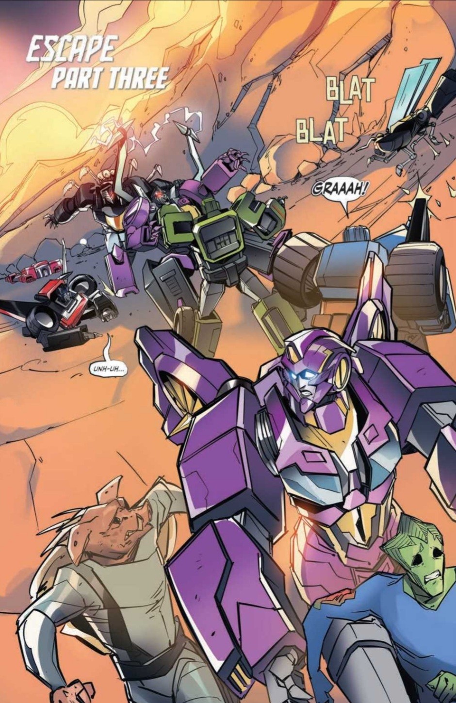
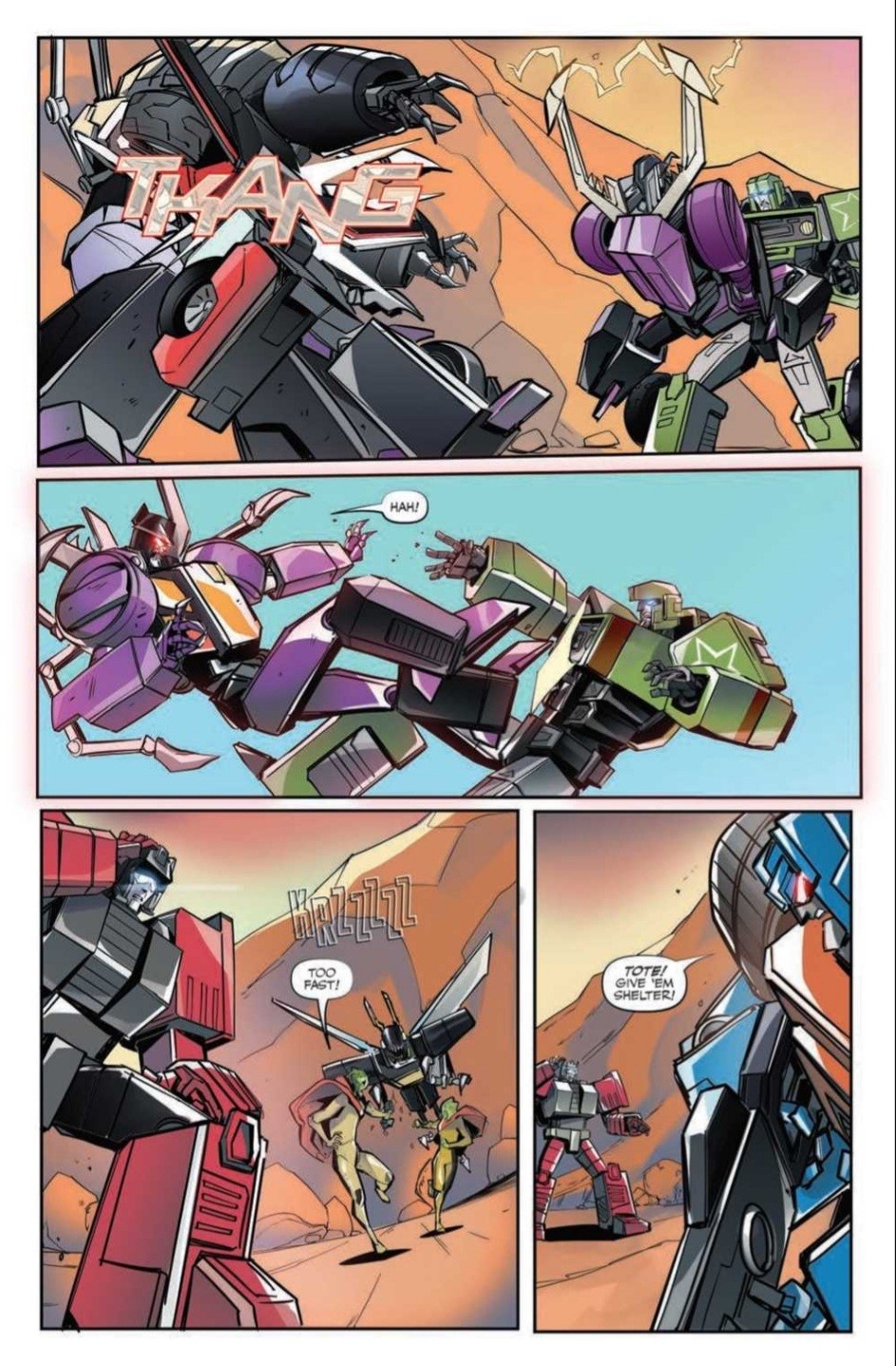
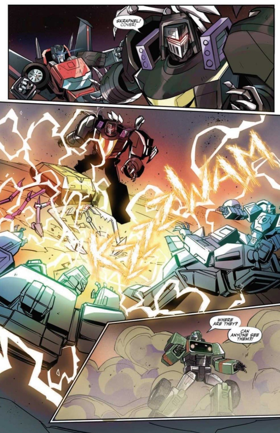
The action shots are messy with lines everywhere - there's no consistency to the shapes or forms between panels & some of the details aren't even drawn in properly, with unfinished half-lines scrawled in all over the place! It looks like any bits that might have called for extra detail were deemed too hard & so purposely drawn small or just scribbled on in the vague hope that either the colorist might hide the laziness, or that they might go unnoticed alongside the large, boring blanks of bland, nothing backgrounds. There are small attempts at detail on some of the bots, but in these instances, areas of incomplete lineart result in poorly defined borders where it's obvious the colorist has been forced to fend for herself in trying to fill in & make sense out of whatever the artist was trying to convey! If half-assing your work so badly that you rely totally on the next person to pick up your slack
isn't sloppiness, I don't know what is!
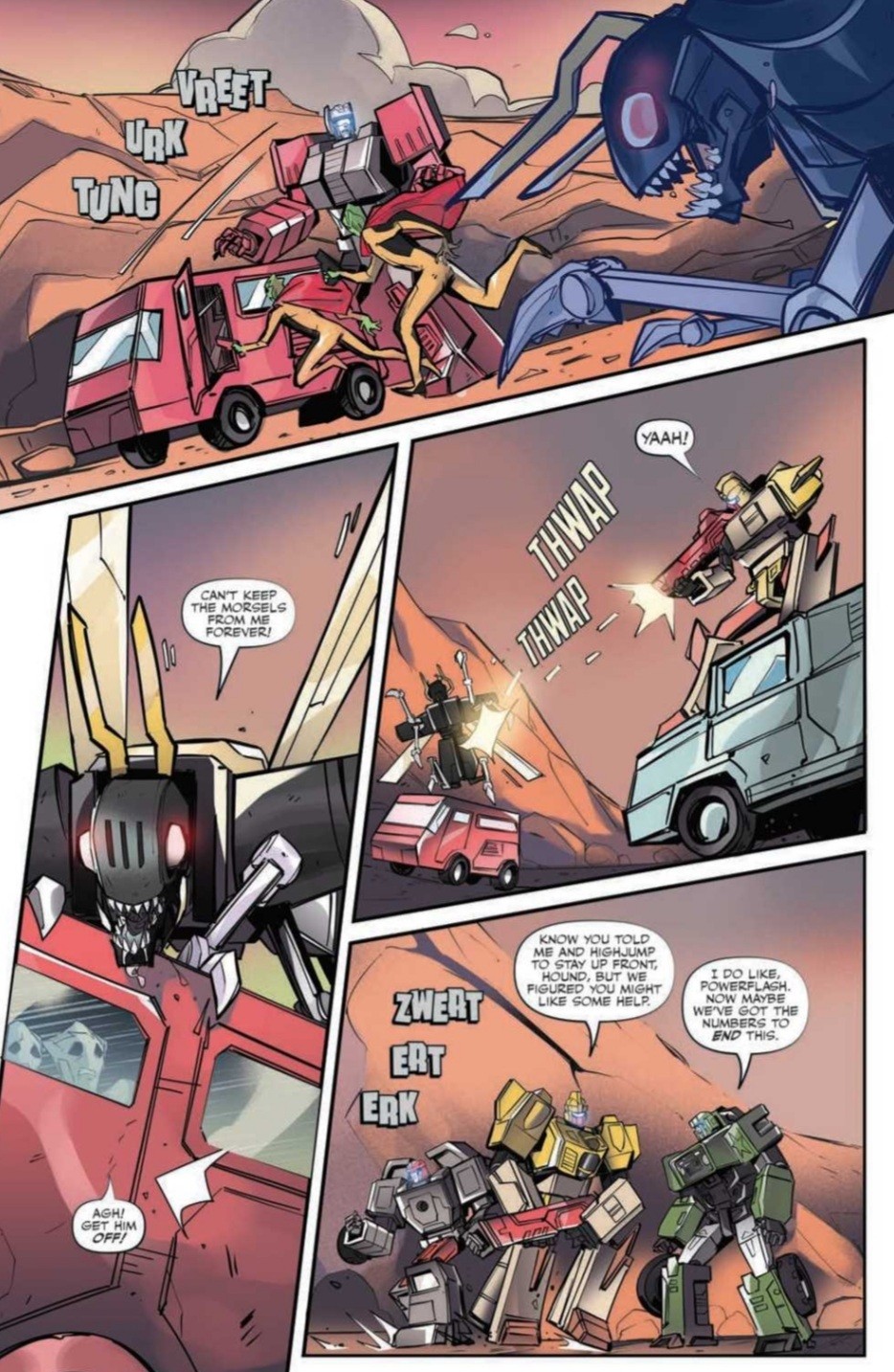
Look at Panel 3 on Page 2: what the heck is going on with Kickback's legs? You could argue that it's not an important detail - the main point of the panel is still clear - but is that really the level of quality we've come to expect from IDW, from professional comic book artists? Just look at Bombshell's head in... well, any of it really, but particularly Panel 1 of Page 4: it took me a while to even register that it was supposed to
be Bombshell in the first place! Aside from it's questionable shading & shape, it looks like he's wearing a helmet within another helmet - which is
bizarre - and his trademark "headdress" is no longer trademark or even a headdress - in that it's completely unfamiliar & now more like part of a backpack rather than attached to his head. On top of that, the shape of the protrusions seem to alternate between panels, sometimes appearing blade-like, at other times more like the familiar, cylindrical shapes of old.
Overall, it just seems like there's a lot of empty space on the page, and where there isn't empty space, we get what looks like something very hastily drawn with very little attention to detail. A similar argument could be made for the Beast Wars book, although I'd at least venture to say the lines in that book are more confidently drawn. Combine the two, add the lackluster dull-fest that is the current ongoing and we have a trifecta of disappointment from IDW! It may well be that Alex Milne, Casey Coller, Guido Guidi, etc. are difficult, high-class art acts to follow, but surely we can do better than
this? I can't believe I'm saying this, but I think even Ramondeli would be an improvement - at least his ultra gritty detail
does help hide the fact that he can't draw lol.
- END RANT -