


 [ Click to attempt signal recovery... ]


Transformers and More @ The Seibertron Store

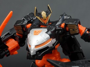
TRANSFORMERS HEADM ...

THE TRANSFORMERS # ...

TRANSFORMERS HEADM ...
THE TRANSFORMERS C ...
NEW!
THE TRANSFORMERS # ...
NEW!
THE TRANSFORMERS # ...
NEW!
THE TRANSFORMERS # ...

THE TRANSFORMERS # ...

TRANSFORMERS UNIVE ...
TRANSFORMERS HEADM ...

TRANSFORMERS HEADM ...
NEW!
THE TRANSFORMERS # ...

THE TRANSFORMERS # ...
THE TRANSFORMERS C ...
These are affiliate links. We may earn a commission.
Details subject to change. See listing for latest price and availability.
Details subject to change. See listing for latest price and availability.