Wolfman Jake wrote:Color really is a very subjective experience.
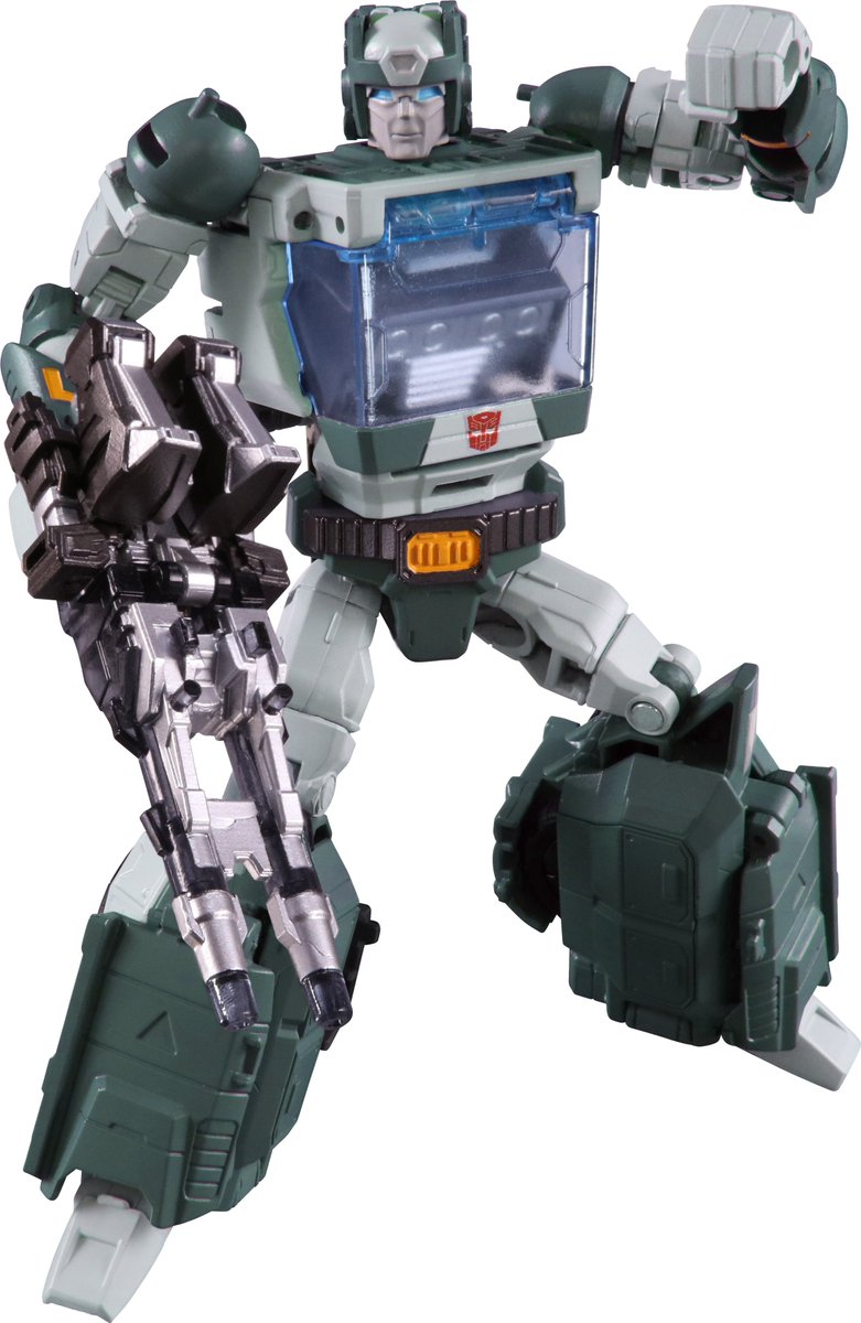
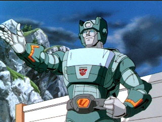
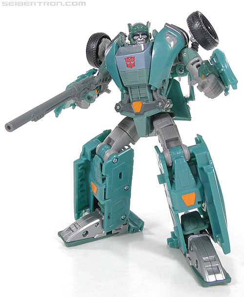
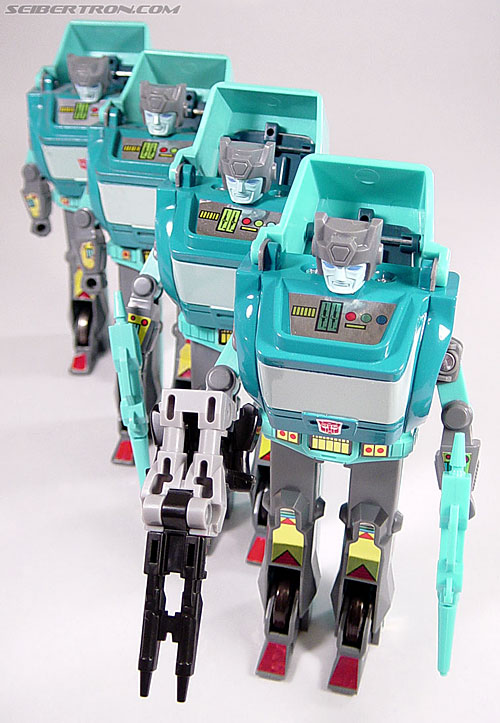
It's not. There's a character who's been around for 31 years. Until this version of him, he's more or less been the same color palette (bluish-green, greenish-blue, or comic book 4 colors only blue). Then there's this figure that is homaging some obscure color scheme from an episode who's entire color palette is too dark (i.e. Ultra Magnus is a very dark red, Spike Witwicky's skin color is way off, etc. It's not just Kup who was too dark of a color in that episode).
Wolfman Jake wrote:Who knew Kup's colors were so hard to really nail down?
They're not. Google Images can be Takara's friend too.

I think what's frustrating to me about this is that instead of them just doing it right, they're doing this one-off oddball color scheme, everyone argues about it online, blah blah blah, and then they later release a convention or online exclusive "anime" accurate or "G1 toy" accurate color scheme, everyone will say "wow, they really did listen to fans" when, in fact, it was just them doing a "well, it's a close enough color scheme, but not entirely what fans want, so we'll do the less desirable one first so that fans buy it, and then come out with the more desired color scheme later so that we can double dip on sales.
This pattern is frustrating and seeing fans argue ad-nauseum is also frustrating. I don't mind seeing a less desirable character get the new mold treatment first (i.e. Sky Shadow over Overlord) but seeing a less popular or inaccurate color scheme first makes me feel like we keep getting taken for a ride.