Latest changes / improvements to the site ...
- Turned off repeat of background image. It was tiling on resolutions greater than 1,980 pixels wide and looked kind of silly because Megatron and Optimus Prime are cut off.
- Changed the font from Eurostile (which CSS3 supports) back to plain old boring Arial because Chrome doesn't anti-alias site provided fonts declared in CSS. * sigh *
- Changed the background color of the hover effect for the site's primary navigation.
- Changed the font color for the text in the site's primary navigation's dropdown menus
- Fixed a few quirky padding and margin issues on the homepage
- Disabled the mobile version of the site until I have further time to work on it. Some of you want to view the full version of the site, some of you want a stripped down version of it ... I'll have to come up with a more comprehensive solution later.
- With that said, this should restore the right hand navigation for you mobile users and should get the site to work again on iPhones.
- If you've got a monitor that provides less than 1,200 pixels ... it's time to upgrade. Enough's enough of catering to people who have resolutions less than or equal to 1024. It's only about 13% of you ... please for the love of all things Transformers go buy a new computer with a resolution of at least 1300. This is no longer the norm. Over 80% of the users on this site use something wider than that.
- Here's something that hasn't changed in the 11.5 years since I started Seibertron.com ... the homepage news stories now tell you how long ago the news story was posted instead of the date. This should be most useful for time zone changes and international time differences. The time "since" a news story was posted is more important to us collectively than the local time stamp.
- On that same note, I finally got around to cleaning up the CSS for the "latest" and "hottest" news stories that appears on the dedicated pages for each individual news story. (i.e. http://www.seibertron.com/transformers/news/new-transformers-rescue-bots-promo-image/23334/). Hottest news stories show the number of views, latest news stories shows how long its been since the story was posted.
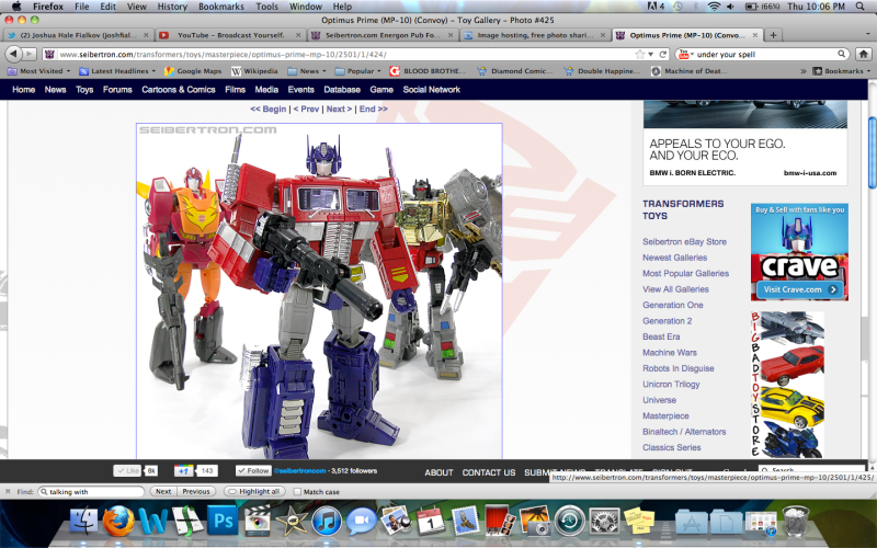
- Cleaned up some more of the CSS on the individual news story pages, added a border and padding around the "thumbnail" news image.
I know this change seemed sudden. It's something that had to happen. I am also aware that some of the changes implemented will make the experience for some less than desirable. Efforts will continue at improving the experience for the largest group of people. Some will be permanently turned off by these changes, some will get used to it, some will deal with it, and others will continue to provide me with suggestions, advice, and compliments as I continue to move forward with this redesign.
I have 12 years of websites under my belt. Websites are ALWAYS a work in progress, at least to programmers they are. It isn't like a piece of artwork where you add the final touches. There's always something to change, improve, etc. With that said, please know that I am dedicated to working through most of these issues.
To those of you complaining about the site feeling "cramped", the content area is only 66 pixels less wide than it was previously. That's not a big difference. The "ad" column is only 46 pixels wider than it used to be, 30 of those pixels are because of the extra padding increases from 10 pixels to 20 pixels, which gives the site a more open feel. If you guys really think 50 pixels will make a difference in the big scheme of things (I don't), I might be able to be persuaded to reducing the width of the padding back to 10 pixels from 20 and getting rid of the padding altogether on the right hand side of the ad column. But I really like the look of the site, the open feel of it ... and the whole point of this redesign was to finally accomplish that goal after having wanted to do something like this for the past 3 years or so since this style started becoming popular on the 'web.
Well, those are my thoughts for the night. Upstairs I go to help my wife unpack some more Christmas decorations.


