I wanted to use this thread again,because i think its really never gonna be outdated.
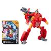
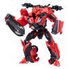
I wanna talk about Starscream design,because i think it needs more appreciated.
I think the design does a great job of making a Transformers that turn into an F-22.
There have been other F-22 Transformers,but Starscream design was made with some considerations in mind,not only based on himself,but on relation to the robots.
First lets look at the size of the F-22 Raptor

Its huge compared to the other vehicles,if he transformed in "Unfold legs and standing up" way he would be taller than everybody!(And we know that not the direction they were going for)
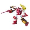
So he was designed in a way the F-22 folded into itself and spreaded the parts in other directions,making the robot mode big,without outsize the other guys.
His robot mode is sharp and makes an intimidating robot.
http://4.bp.blogspot.com/_IpsH_JdaCsY/S ... ckup03.jpghttp://2.bp.blogspot.com/_IpsH_JdaCsY/S ... scream.jpgHis back has Wings coming out(A nod to his G1 design)and 2 rockets jets.Its nice detail to have,explaining how he is able to fly in robot mode.

His chest is broad and wide with small wings on his shoulders.
The conkpit on his chest is another reference to G1.
His arms are big and long.Some say the arms are too long,but i think if they were shorter ,if whould look like very stubby and have a very short reach.
HIs bulit-in weapons are awesome,with his rocket launchers which can into a Buzzsaw!(

)
Its also cool how the robot mode's machine gun is the same as the Jet mode.

His legs keep the theme from rest of the body.Sharp looking.
And now,to his head:
I enoy the whole Samurai helmet look he got going.


Some people say he has no face.Lies!Lies i tell you!

So this was my insight on Movie Starscream.I just wanted to express to people why he is one my favorites Starscreams.


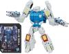
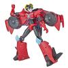
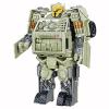
 Optimus Prime,Jazz,Bumblebee,Roadbuster, Dino/Mirage,Sentinel
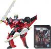
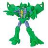
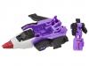
 Megatron,Soundwave,Starscream,The Dreads,Blackout,Sideways,Barricade,Rampage