


Transformers and More @ The Seibertron Store
These are affiliate links. We may earn commissions when you purchase items or services through these links.
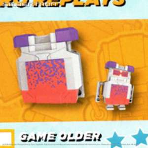
GAME OLDER Transfo ...
NEW!
OPTIMUS PRIME + Mi ...
NEW!
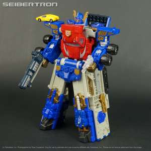
ARMADA OPTIMUS PRI ...

TIDAL WAVE Transfo ...

SIDE BURN Transfor ...
NEW!
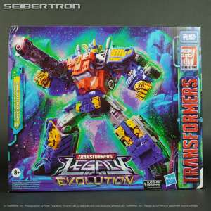
UNICRON + Mini-Con ...

CYBERTRON DEFENSE ...
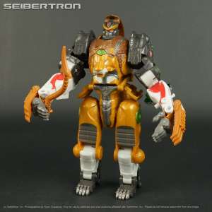
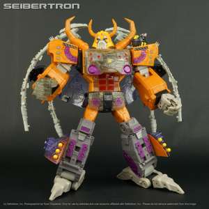
LEOBREAKER Transfo ...

MX-00 UNICRON + DE ...

MEGATRON Transform ...

STARSCREAM Transfo ...
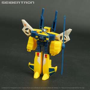
Armada POWERINX HO ...
NEW!
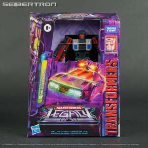
WILDRIDER Transfor ...
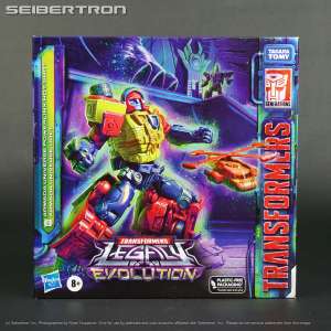
EVAC Transformers ...
* Price and quantities subject to change. Shipping costs, taxes and other fees not included in cost shown. Refer to listing for current price and availability.