Motto:
"Don't forget to subscribe to the official Doctor Who youtube channel"
Weapon:
Temperature Variant H20 Gun
Sowndwave76 wrote:Kurona wrote:Sowndwave76 wrote:Kurona wrote:SillySpringer wrote:Kurona wrote:Well that's fine, it's just... the original toy and character had a really bad colour scheme, and it becomes all the more apparent on a modern toy. It's not even hilariously bad like G2 Bruticus or anything; it's just... really boring to look at.
It's not necessarily the toy's fault or anything, just the original character design.
That's why I think new ideas are sometimes good.

Same. As long as it doesn't drastically go against the spirit and character of the original, I'm all for updates and improvements rather than having to remain 100% loyal to the original cartoon or toyline.
I mean hell, I adore Sky Reign. I want more beautiful things like that.
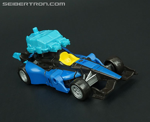
Please know I'm not trying to argue here... But his original colors are so simple I don't see how you can say it's a bad color scheme. And in terms of yellow being a bad choice for a modern toy (especially with a car alt mode)... I don't see much validity in that either.
And my original post wasn't anti-new ideas, or especially improvements. I'm one who has been giving these lines a lot of credit.
If you like varied paint apps from the looks of original characters, awesome for you.
But I don't get how people feel they can say staying relatively close to the original look is awful, bad, etc.
Especially because it's not like this is the third set of updated G1-esque Sunticons in the last 8 years.
Because, well, sometimes we feel the original look is just bad.
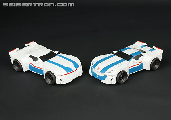
G1 gave us a lot of fantastic, iconic designs. Optimus, Starscream, Soundwave, Grimlock. But not all of them are great and - especially when concerned with art and design - it's extremely subjective what's good or not. A pure yellow colour scheme with little detailing to settle apart just doesn't appeal to me - it's one of the problems with Armada Hot Shot for me too; just so much yellow is very boring and blotchy and unappealing. Some colours work fine on their own - again, Dead End's shiny red in UW works extremely well for me. Yellow just isn't one of those ones that works. Hence why I much prefer CW's update.
If you like staying absolutely true to the cartoon over everything else and you prefer those colour schemes, then yeah, all the power to you - I just really don't like Drag Strip's original colours.
Look... I get this is all subjective. And this is all opinion-based.
Yes, I would expect figures in these lines to be very show-accurate... 1. That's what these on toys are based on. 2. Again, this isn't the third or even second round of updated Stunticons (at least ones that combine that have had a regular retail release)... If it were, I'm betting changes from original designs would be more than welcome.
I'm not a huge fan of the color yellow. But UW version is pretty close to what Dragstrip the character looks like. So I'm okay with it.
I think I like fairly accurate colors because with these updated versions, there already are changes (sometimes major changes) from the original designs.
Almost every figure in these lines could be used as an example of this.
Actually...
1. That's not what they're based on. That's what UW is based on. Hasbro's priority is basing them on the original toys - and beyond that, they might incorporate the show; but equally they might incorporate the Marvel Comics, and even more likely than that recently the IDW comics. In particular, First Aid is very close to his IDW design, especially in his head sculpt.
2. Yes... but it's the first time updated Stunticons have actually been purposefully made as an initial purpose, and to combine. The other times were basically finding any autobot car mold and painting them into any random Stunticon. It's practically impossible to make a Mirage toy without turning it into Drag Strip at one point - which makes sense. They have to redeco a toy at one point to make up for production costs, Decepticons are the easiest way to set an Autobot apart, and Stunticons are the easiest way to turn an Autobot car into a Decepticon.
Look, I'm not saying there's anything wrong with you liking cartoon accuracy or anything; I've stated that a ton of times. I'm just saying I don't like the UW colours for Drag Strip and I much prefer the CW design. That's all. Let's just be thankful that Takara and Hasbro do very different takes on things that pleases different audiences and be happy about it, yeah?