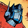
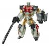
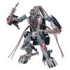
I think the faces suit the Decepticons much more than the Autobots. Again, I think Megatron's face looks
perfectly angular and evil in the big battle scene spread.
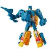
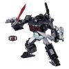
I really like Don's movie influenced style for the bodies of the characters. The increase of mechanical details and more streamlined look doesn't overpower the overall visual impact for me. I still see the substantial chunky/blocky silhouettes of the G1 designs of the early 80s big anime robots. While the basic stout body proportions are kept, the mechanical detailing adds a sense of depth to the character designs and makes them more convincing as mechanical structures that can reconfigure their forms. I love G1 and its aesthetics but the sometimes overly simple designs make the characters trans
morphers more than transformers.
One could argue that the amount of mechanical details are a bit too visually busy but I think it's not as severe as what we see in the live action movie designs, which I love but think are hard to appreciate when a lot of the robots are involved in action scenes. I particularly enjoy poring through Transformers art, comics, cartoon screen caps, and live action movie concept art so I am biased towards more details.
I mainly have two issues with the face style. First, the concept of making the face be composed of multiple plate is great for implying believable movement, simulating human facial muscle structure. However, the way that Don draws the faces make the characters look cadaverous. I've read the reasoning for this was partly to allow more expression but it actually seems to counter that intent. The range of expressions are limited to frowns and toothy, gumless rictus grimaces.
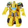
In the linked image below, looking at Bumblebee's face, I don't know what to make of his expression. Is he in mid sentence? Is he supposed to be showing a deadpan expression? Is he grimacing? I mean look at those hideous teeth of his. Now that's a candidate for braces if I ever saw one. Looking at Hot Rod, I assume he's giving a neutral/deadpan expression but he looks a little dopey.

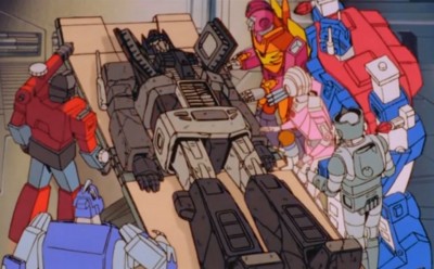
Secondly, the proportions seem to be consistently off. Small faces framed by large helmets make the characters look somewhat comical from some angles. In the battle scene below, Ironhide and Bumblebee are wearing helmets that look like they make the heads twice as large as they should be. At least for Bumblebee where you can see a significant portion of his torso and shoulders, his helmet doesn't look too big, it's his face that looks too small for the helmet.

If the way that faces were drawn was refined, not necessarily "changed", I would have no complaints about the style. Don is a great artist so I'm wondering why these details aren't being noticed by him or perhaps if he is aware of how they look to others why he doesn't see them as being something that doesn't require improvement.


 CBR recently posted an